Project overview
Background
Sky's Entertainment OS (EntOS) platform was enhanced to support multiple price points for Partner subscriptions. This prompted a redesign of the existing Commerce journeys.
This was an 11 month project. I joined at 3 months, following the 1st round of user testing.
Customer problems
• Fragmented pricing experience: customers could only view 1 pricing plan on TV, requiring a 2nd device to see alternatives. This introduced friction and risked undermining trust in the purchase journey (lack of transparency).
Business Goals
• Onboard more partners: A successful launch with Disney+ served as a proof of concept to attract and onboard additional partners to the model.
Scope and Constraints
Scope was mainly Prospect (New Customers), Existing and Sky Q Legacy customers
Constraints related to
• Templates: limited to pre-defined components within the TV Products Commerce system.
• Contractual obligations: considerations around legal agreements with our partners.
The Process
1. Understanding the current experience
2. Regroup of existing work and previous research
3. Testing
4. Refinement
5. Future thinking
Success Metrics
• Increase in conversions (% of customers who complete a purchase) - baseline of 23.2% before release.
• Decrease in cancellations during a Price increase window (customers opting to downgrade instead).
• Increase in activations due to the addition of a more contextual journey.
• Attraction of another app partner who would want to adopt the new model.
Results
Within 12 weeks
• Conversion rate (% of customers who complete a purchase) increased to 47.8% (due to the lower price points being available)
• Cancellation rate: this dropped by 16% (more customers opted to downgrade rather than cancel)
• Activation rate: slight 2.8% uplift
• Partner adoption: another app partner expressed a strong interest in adopting the new tiering model thus reinforcing its scalability and strategic value.
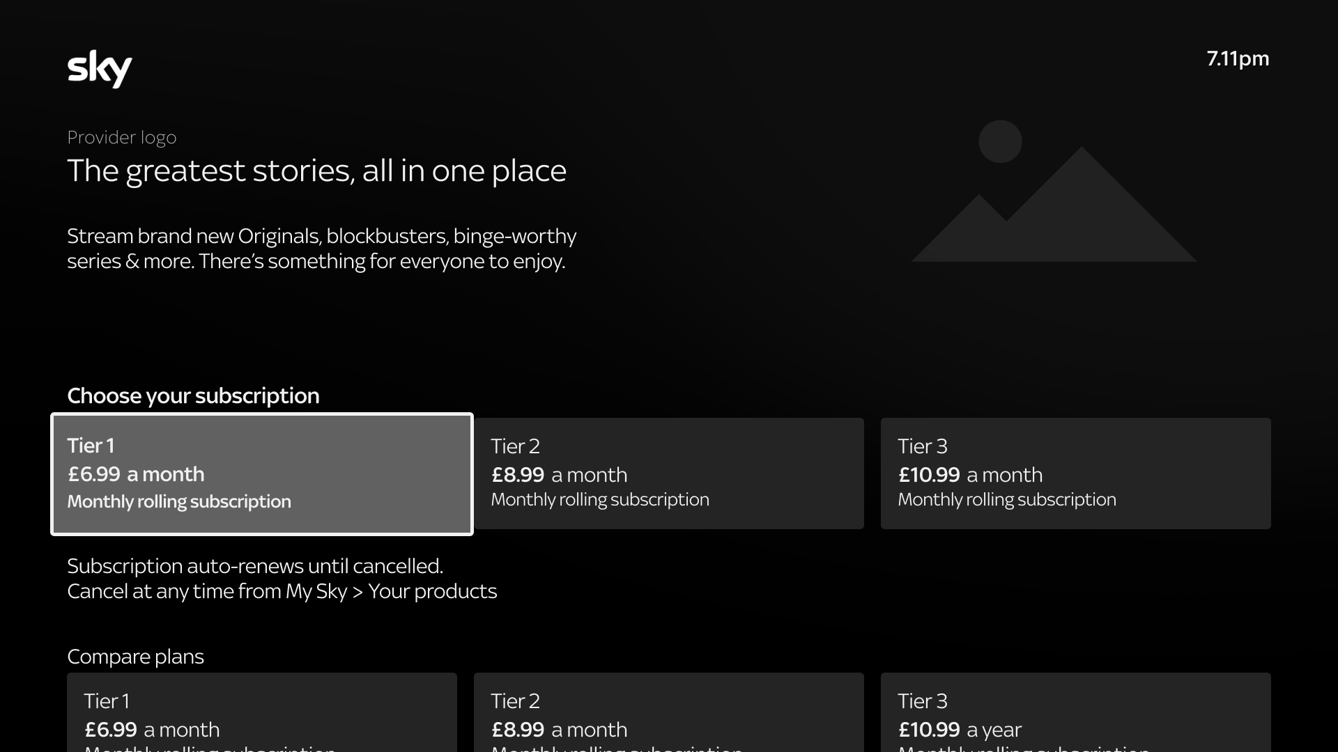
New Plan Page
Original Plan Page

The Process
Understanding the current experience
Joining part-way through the project, I began assessing the existing journey to uncover key user pain points.
The most immediate issue: customers couldn't compare all available price points directly on TV; creating friction and reducing purchase confidence.
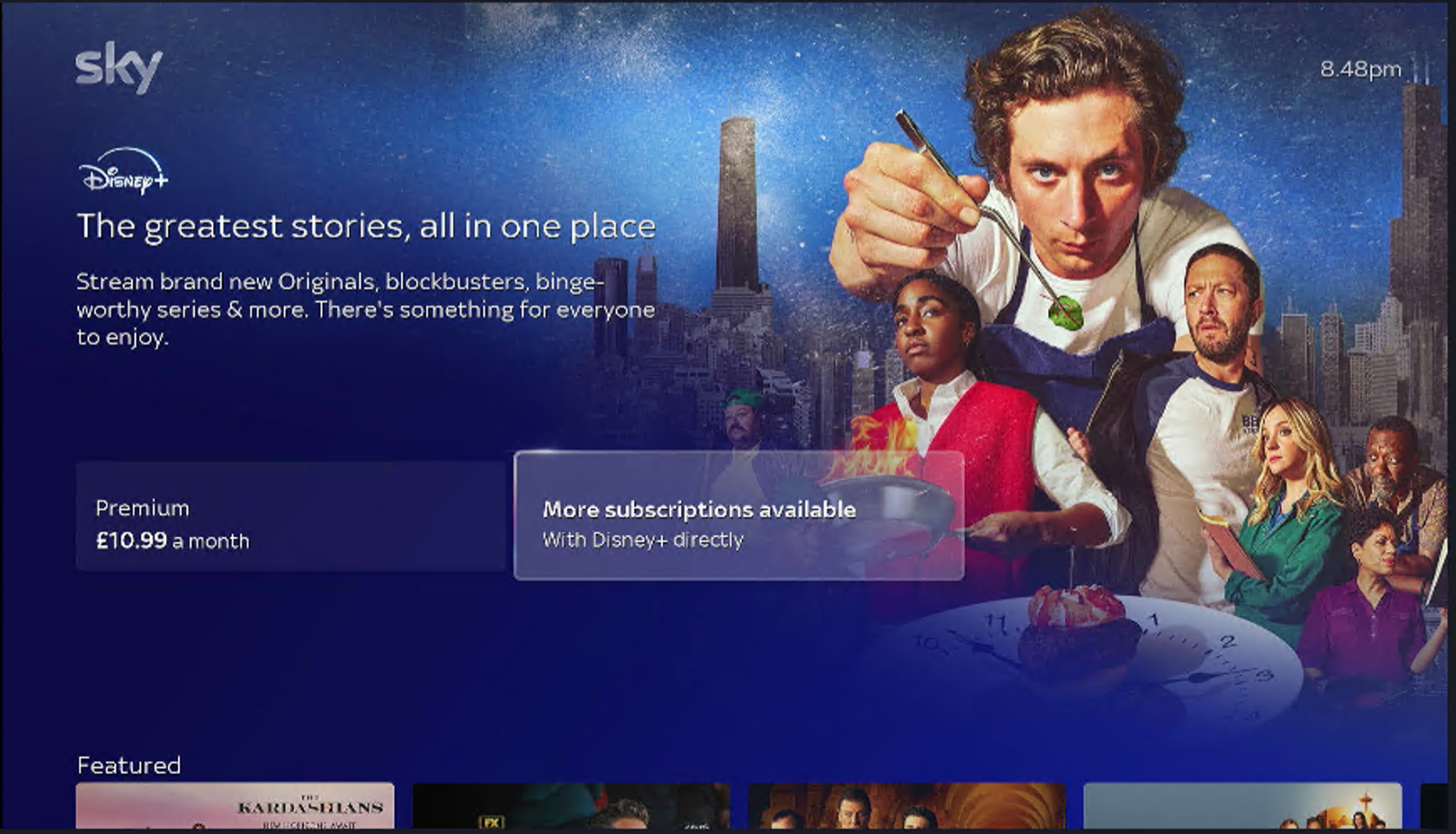
Customers can only select a single price point on device
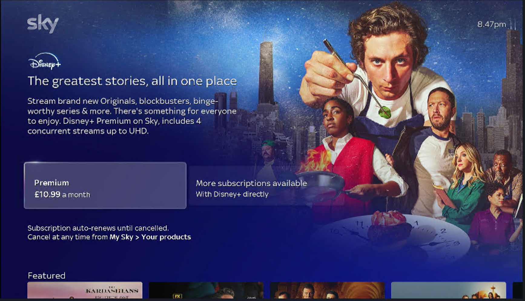
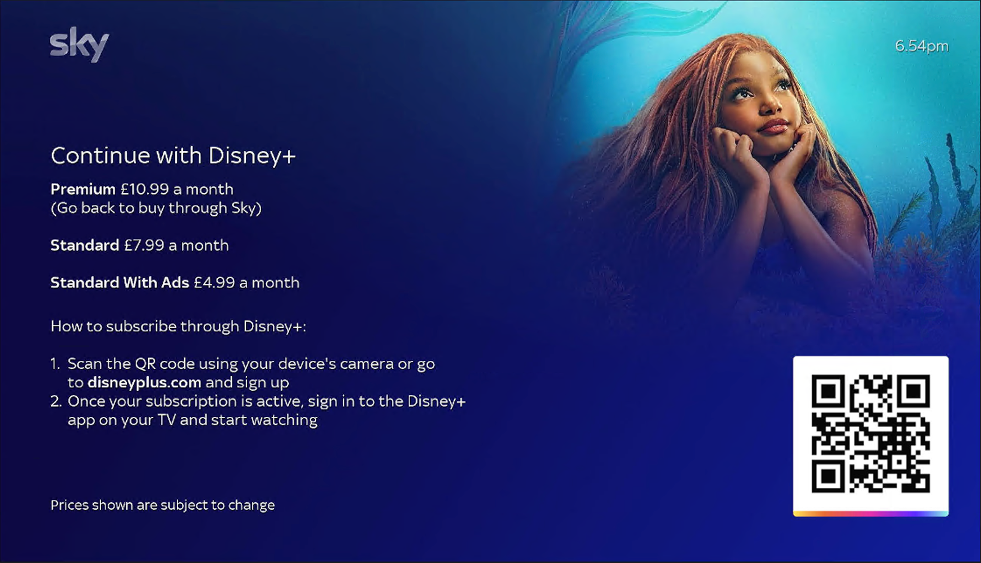
Customers can view other tiers but would need to visit the Partner website (via QR code scan) to fully compare and select their desired subscription tier.
Short recording of current journey (entry point: Sky Shop)
Reviewing existing work & identifying opportunities
I then began reviewing the progress made by the previous designer; including early research, design decisions and journey logic. This was to ensure continuity and avoid duplication.
From there, I identified opportunities to refine and strengthen the experience.
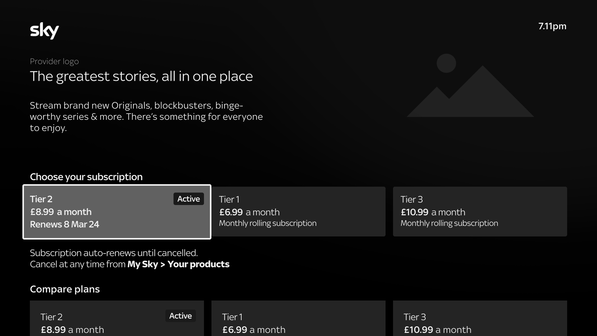
Prospect customers saw tiers listed in ascending price order
Existing customers saw their current plan marked with an Active badge; with other tiers also listed in order of ascending price
Prospect customer

Existing customer
UX Copy Refinement: Rethinking the 'Active' tag
I proposed renaming the Active tag to improve clarity.
For customers who hadn't yet activated their subscription, the Active tag could risk confusion (Consistency and Standards) particularly when accessing the journey via 'Your Products' where expectations around subscription status clarity would be higher.

Your Products
Existing customer
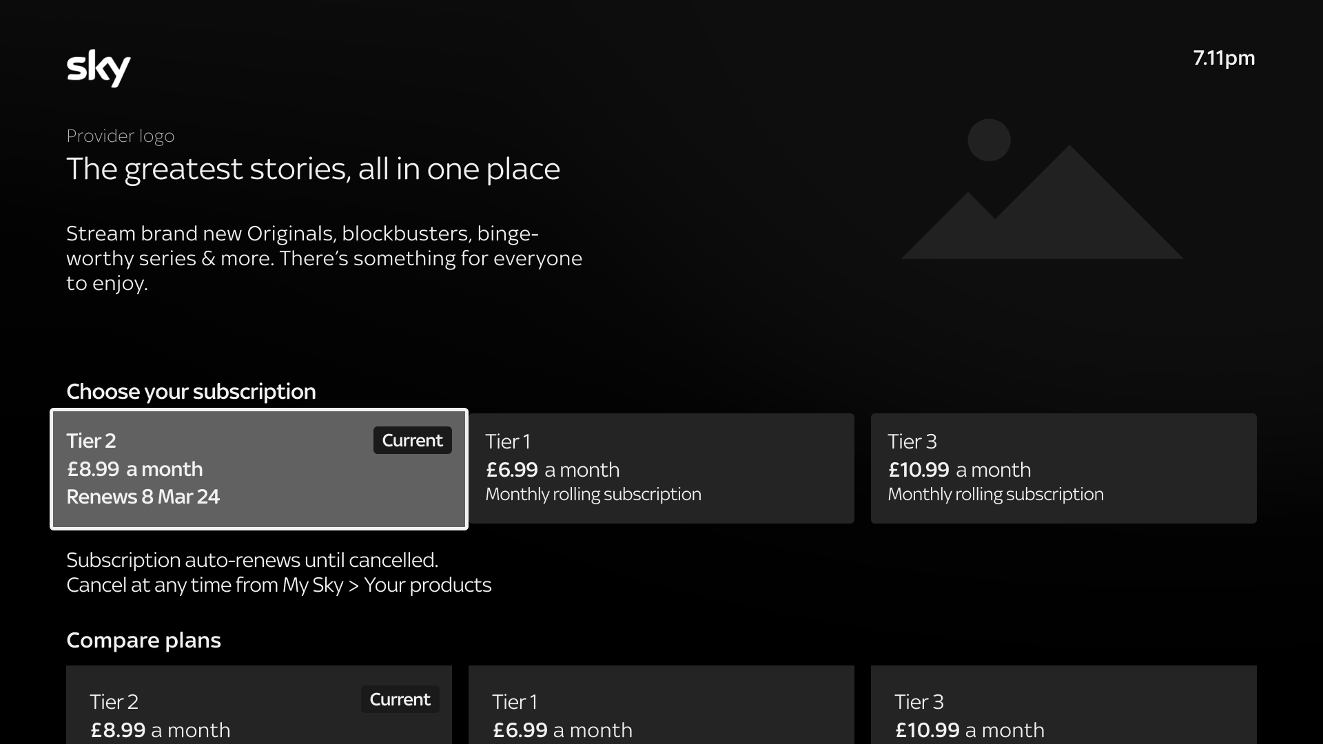
Proposed a change from Active tag to Current
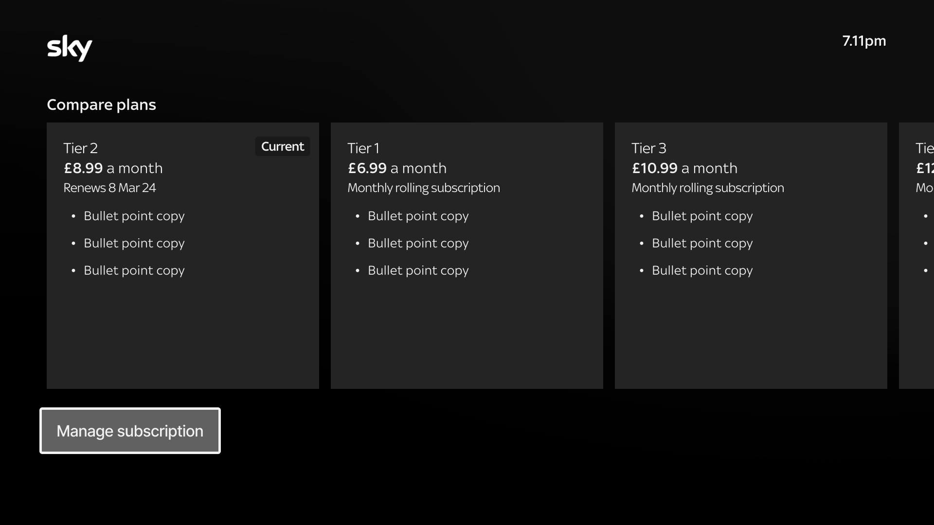
Interaction Design Constraint: Dual- Rail selection
The UI featured 2 rails. The top rail showed high-level info (e.g. price) and the second rail detailed each tier.
Although customers could select from either, the interaction felt redundant and cognitively heavy.
I looked in to optimising this but the feedback from our Developers and Design management confirmed limited flexibility within current Commerce templates. That said, Product and Design directors supported revisiting our templates at a future date to improve scalability and UX.

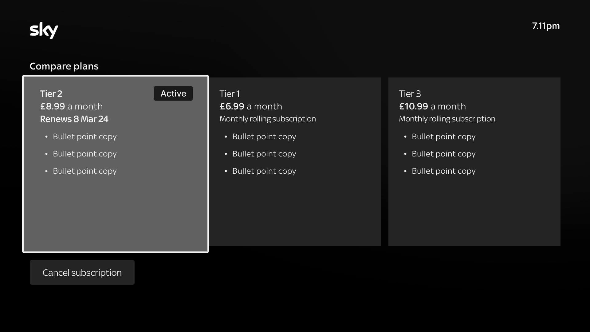
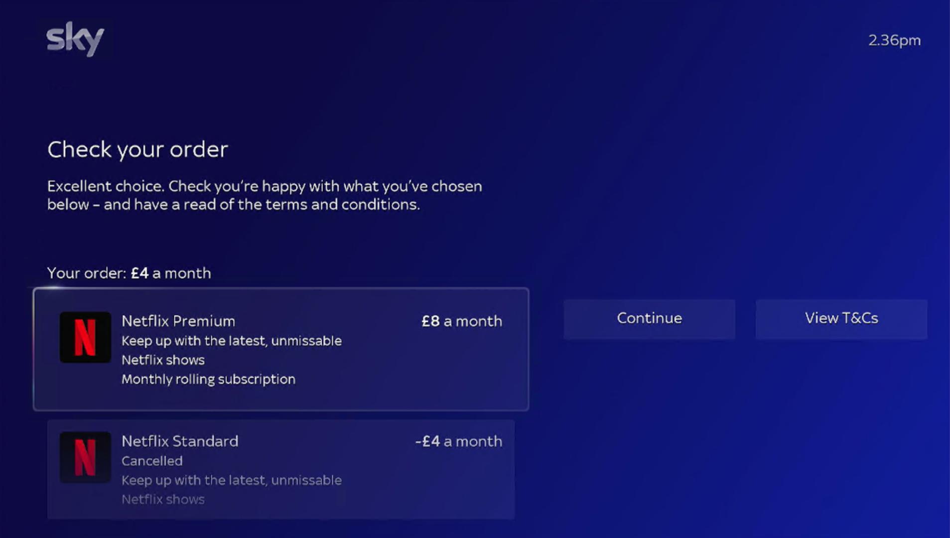
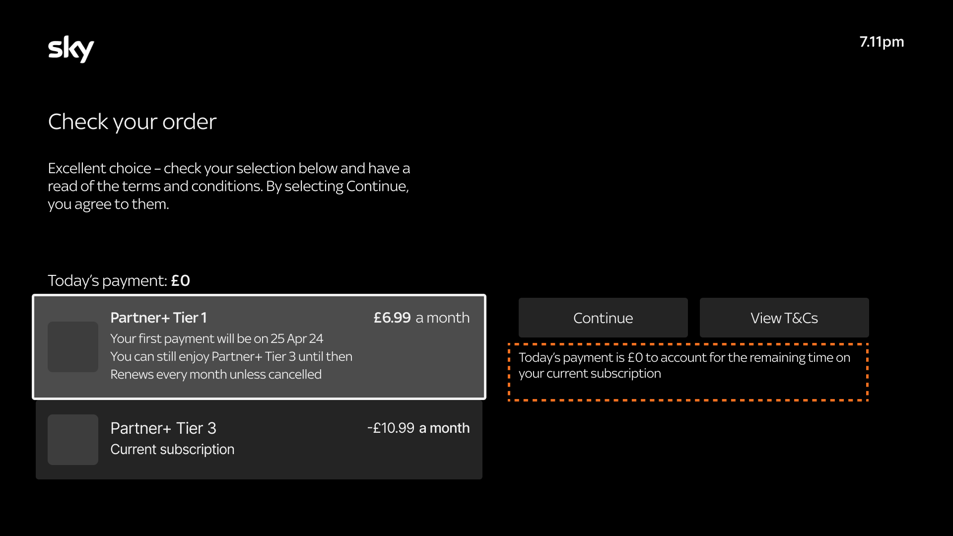
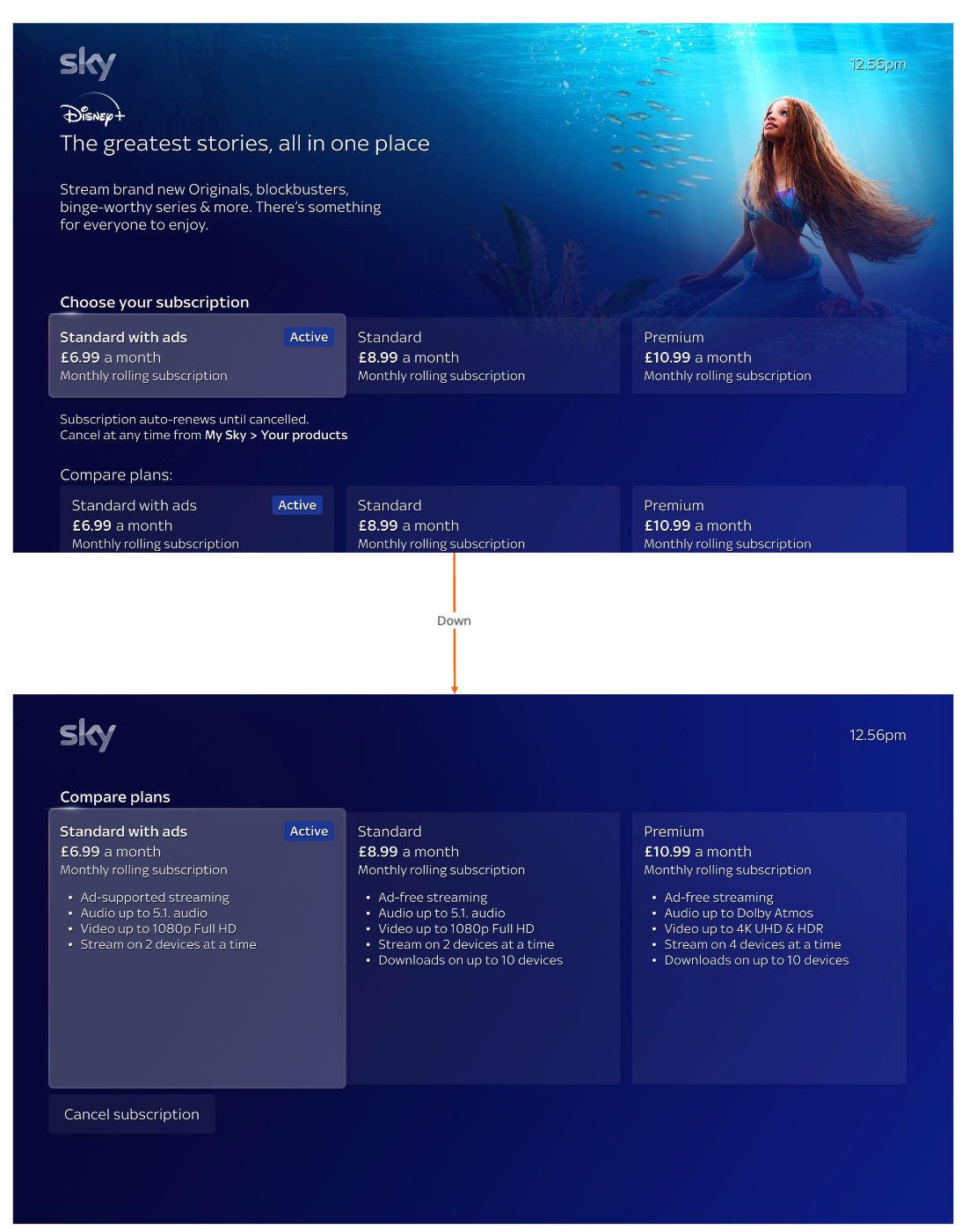
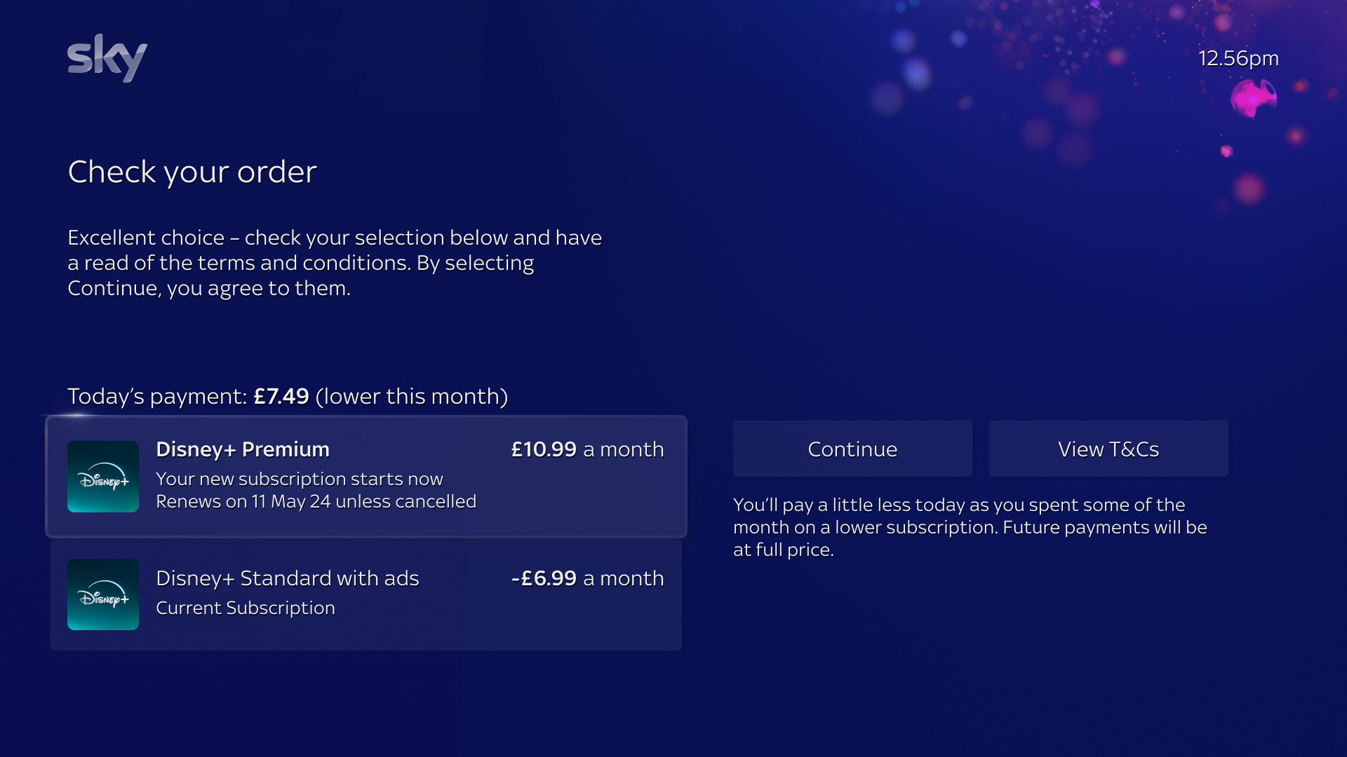
Reducing Friction with Clearer Order Summary Copy & UI alignment
To address confusion around payment amounts, I proposed clarifying copy to the upgrade and downgrade Order Summary pages.
This helped customers understand why their payment today might differ from the listed tier price, reducing drop-off and improving trust at a critical conversion point.
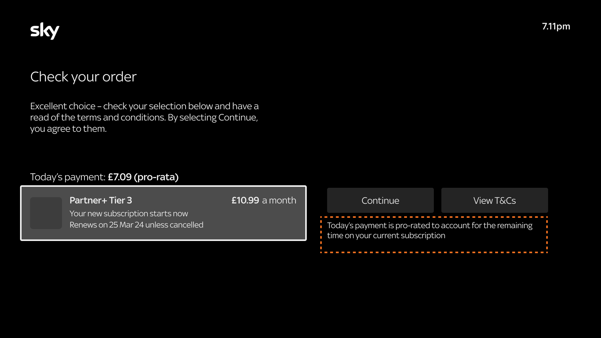
Upgrade order summary

Downgrade order summary
I also redesigned the Order Summary page to align with the existing Glass UI for a consistent visual language across the platform (Consistency and Standards) to reinforce user trust and familiarity during the purchase flow.
Post-Purchase Prioritisation: Content over Account Management
An earlier proposal included a post-purchase link back to 'Your Products' but I recommended directing users straight to their content instead; addressing their most immediate need (Aesthetic & Minimalist design).
Retention Strategy: Informed by Prior Testing
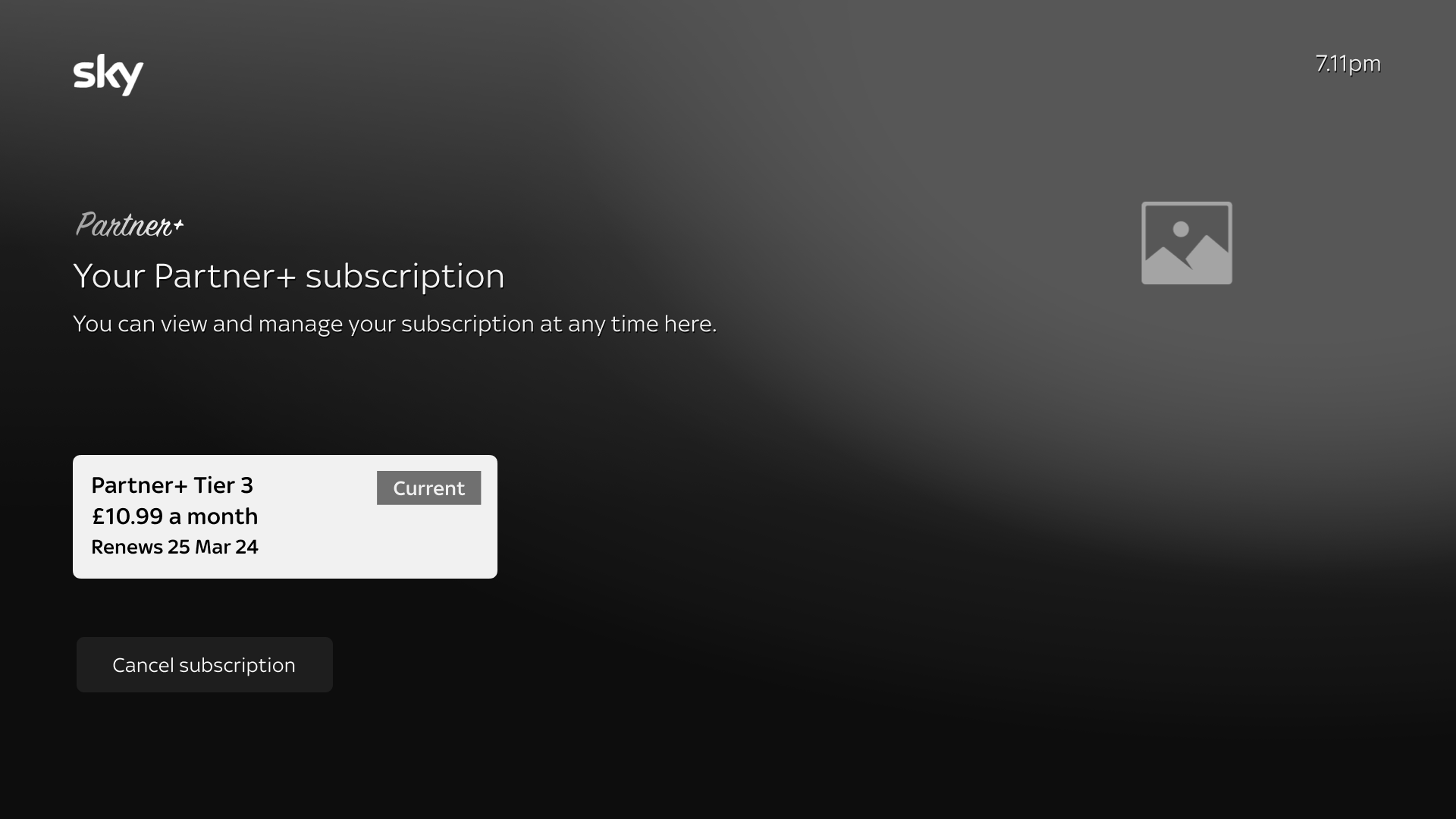
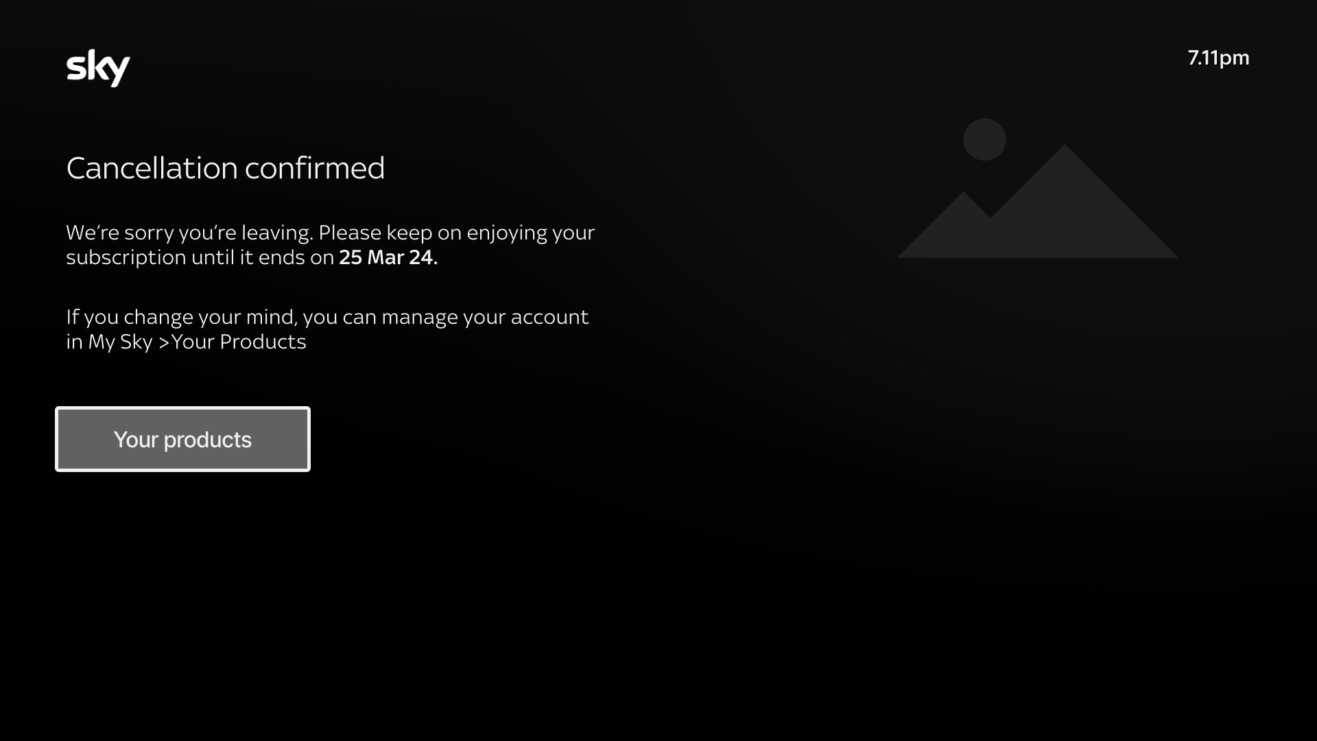
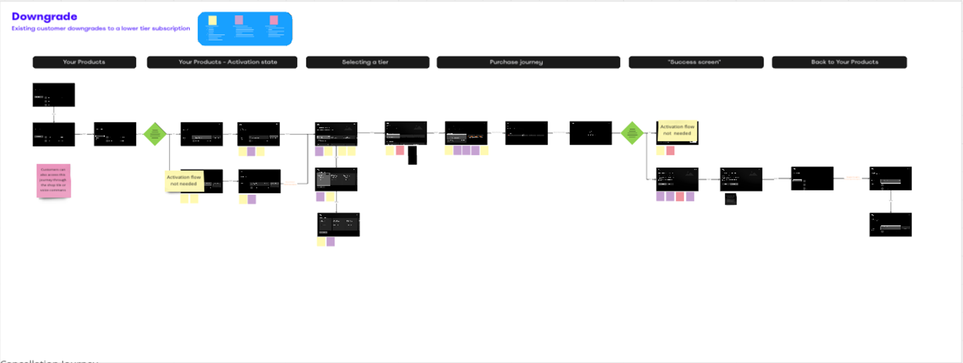
I also saw further opportunities to optimise the existing 3 step cancellation journey.
Step 1
Step 2
Step 3
3 step cancellation journey
An opportunity to optimise by including a retention screen
I reviewed insights from the 1st round of unmoderated testing, which explored how customers prioritised tier features.
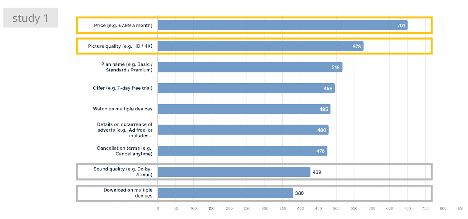
Participants ranked Price as most important
Using these findings, I shaped the direction of the retention messaging:
• For higher tiers, messaging would be focussed on price savings.
• For higher tiers, messaging would be focussed on price savings.
• For lowest tier, it would shift focus to continued access to content - aligning with what mattered most to users.
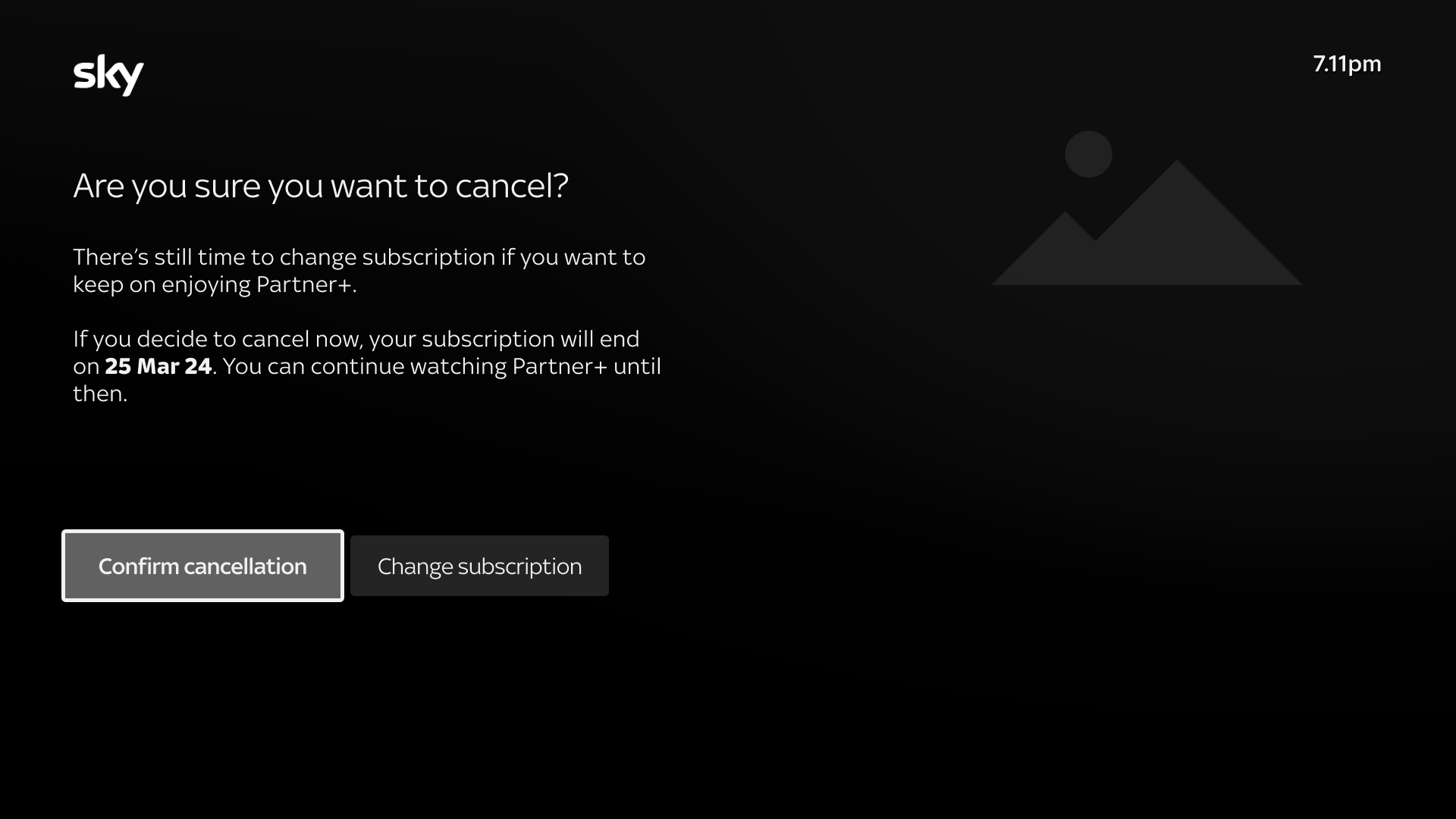
Retention screen
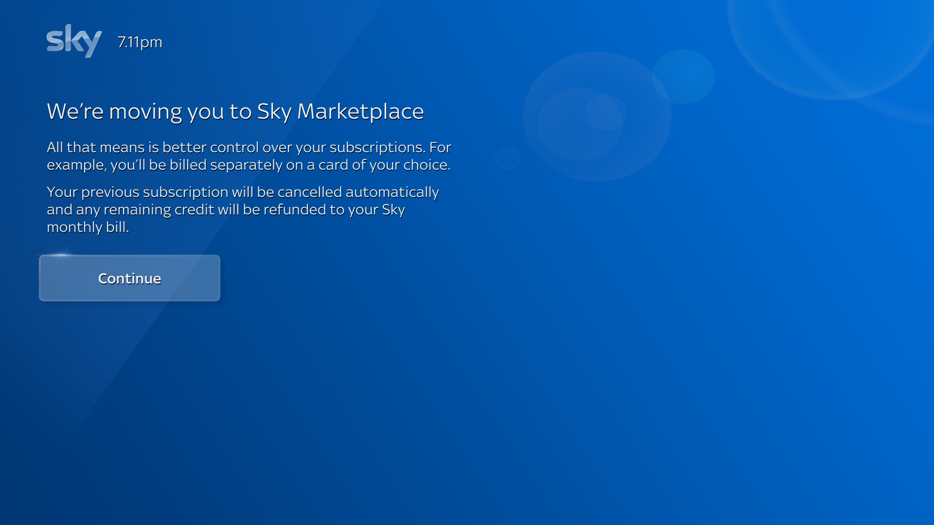
Supporting the Sky Q-legacy base
I also optimised our Sky Q-legacy journeys, which account for around 14% of the existing marketplace user base.
Previously, Q customers subscribed via their Sky bill, but first time App Marketplace purchases require card entry, with no guidance provided. .
To improve clarity and reduce drop-off, I proposed a Q-Legacy intercept screen positioned after tier selection and before the purchase flow to set clear expectations and reduce friction.
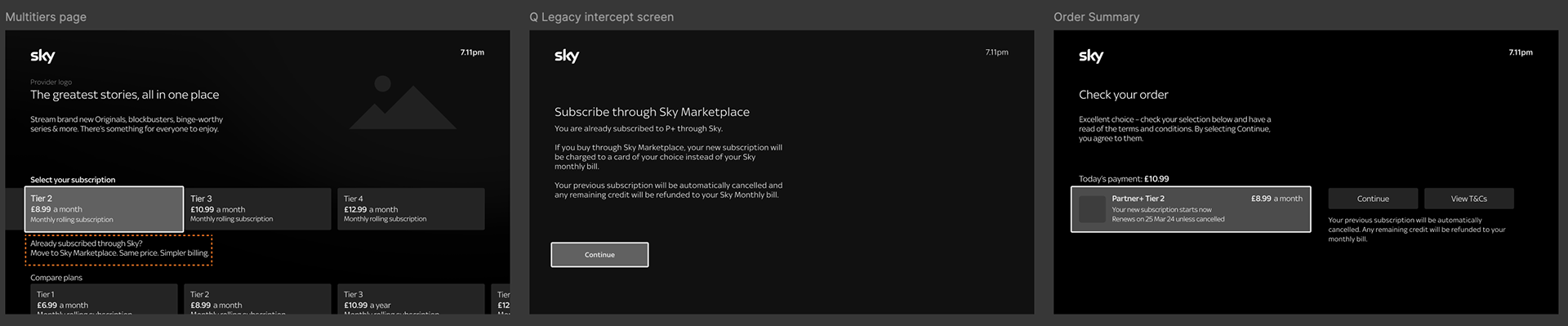
Multi-tiers Page Q Legacy intercept screen Order summary
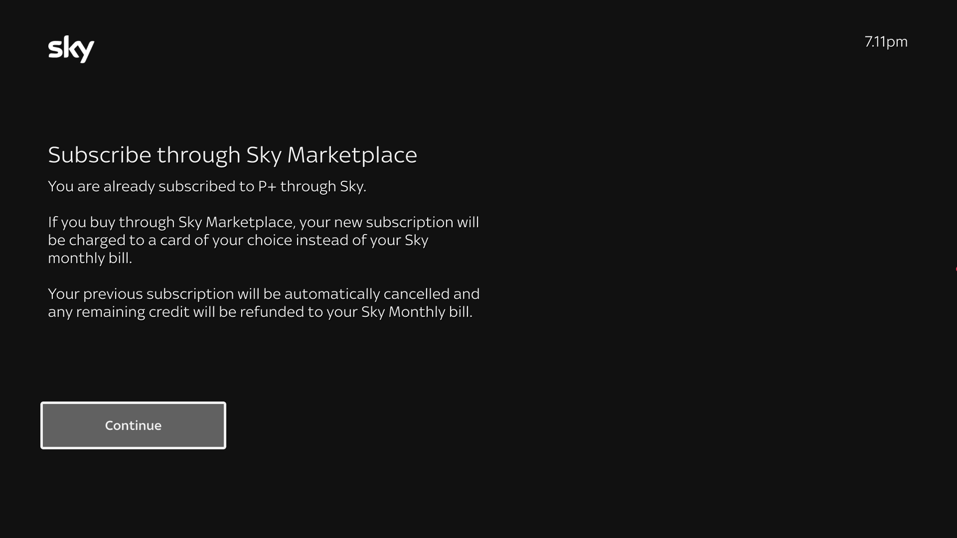
Q Legacy Intercept screen
Contextualising the Activation process
I identifed a key opportunity to improve our Activation flow, where customers were prompted to scan a QR code post-purchase to activate or create their account on web. .
With activation rates stalled at 11.9%, the main friction points were device switching and lack of clarity around activation benefits.
To address this, I proposed an intercept screen during upgrades/downgrades designed to provide immediate context, reinforce value and encourage completion of the activation step.

Activation Intercept
Activate now ---> QR code
Activate later ---> Continue their journey to plan page
An existing customer (intent on purchasing) who hasn't activated their account would be prompted to activate just before entering the sales journey, regardless of the entry point; making the step both timely and relevant.

Your Products

Activation Intercept
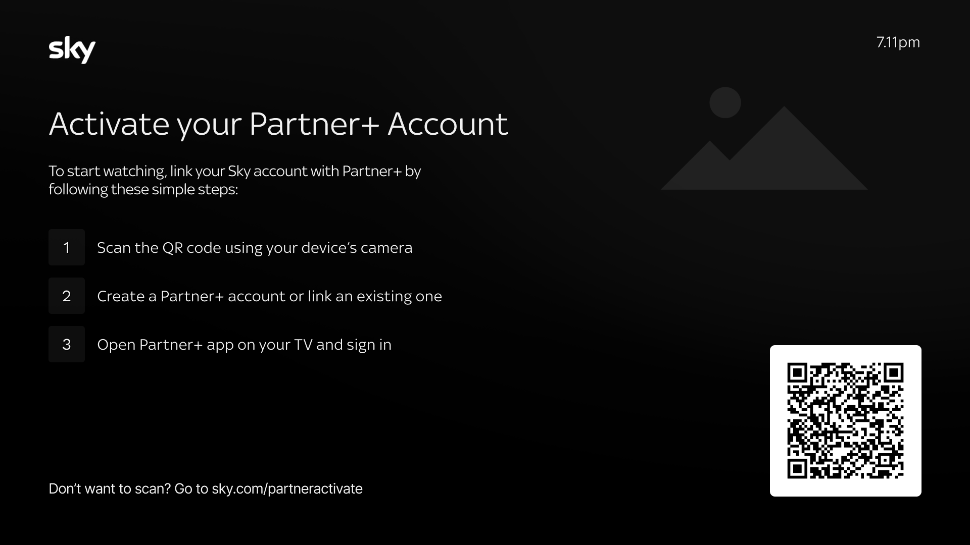
QR code screen - web handoff to create the customer account
I validated the Activation intercept screen with the Product and the Commercial team to ensure it wouldn't negatively impact the sales journey. With no concerns raised, I was green-lit to include this within the Multitiers scenarios.
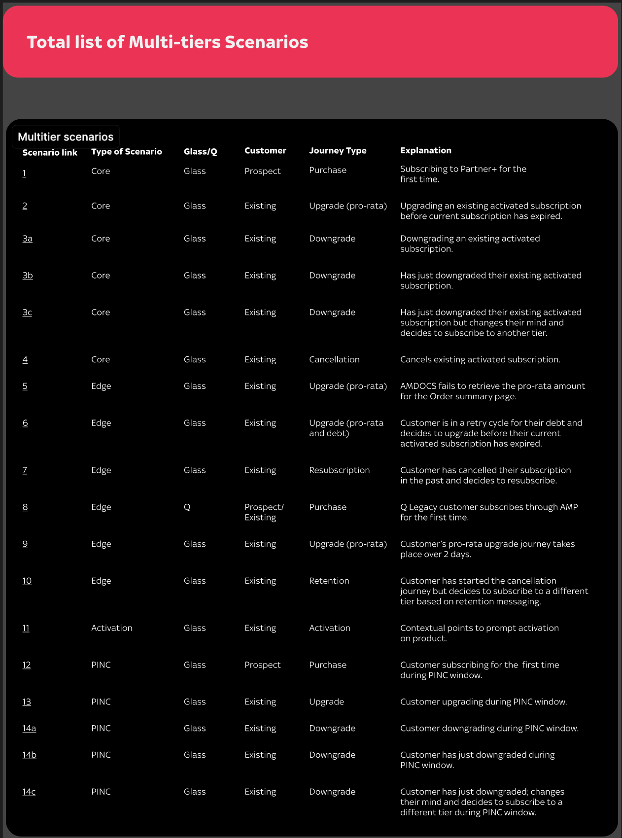
Scenario mapping: a new way of working
As the project progressed, new edge cases kept being uncovered such as customers upgrading before their current subscription expired or attempting to upgrade while in arrears for e.g
To maintain alignment across teams, I developed a scenario mapping system within Figma to track relevant scenarios, centralise logic decisions, and communicate implications clearly to collaborators and stakeholders.
2nd round of Testing
While earlier research focussed on feature ranking, I wanted to assess the intuitiveness of comparing tier features and uncover further optimisation opportunities.
Working closely with UXR, we defined Research objectives to
• Identify any barriers to subscription tier migration.
• Evaluate the impressions and interactions in the cancellation journey.
• Identify ways to improve the transition process from Sky Q to AMP (App Market Place)
• Uncover any further opportunities to optimise the Multi-tiers journey.
Given limited researcher capacity and tight timelines, we opted for self-serve unmoderated usability study.
Collaborating with the Product Manager and UX Copywriter, we selected 3 key flows to test (each with 8 participants):
• Study 1: Upgrade
• Study 1: Upgrade
• Study 2: Downgrade and Cancellation
• Study 3: Q-Legacy
I documented these flows in Miro and encouraged the Product Manager, Copywriter and the UI Designer to add their questions or hypotheses to each screen.

This was to guide me in how to structure the questions/tasks for the unmoderated testing.
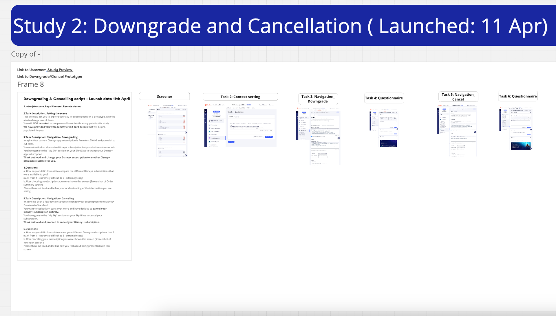
Downgrade & Cancellation testing script/tasks
Participants completed test tasks while thinking aloud, with sessions recorded for review.
I analysed the recordings, capturing key observations from both actions and verbal feedback.
These insights were then synthesised into high-level findings for each task within each study, forming the basis for design recommendations.
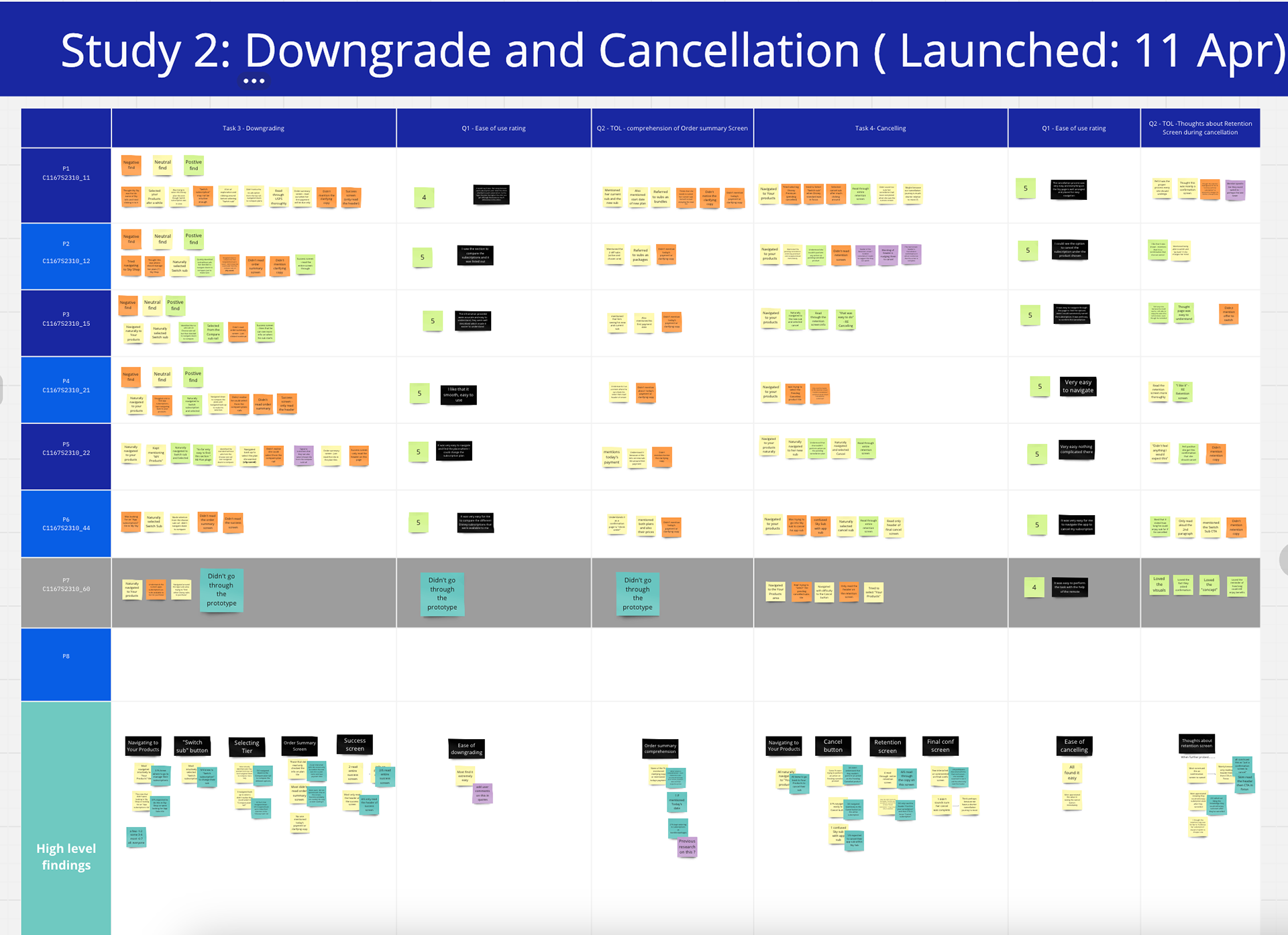
Data collation
Close up
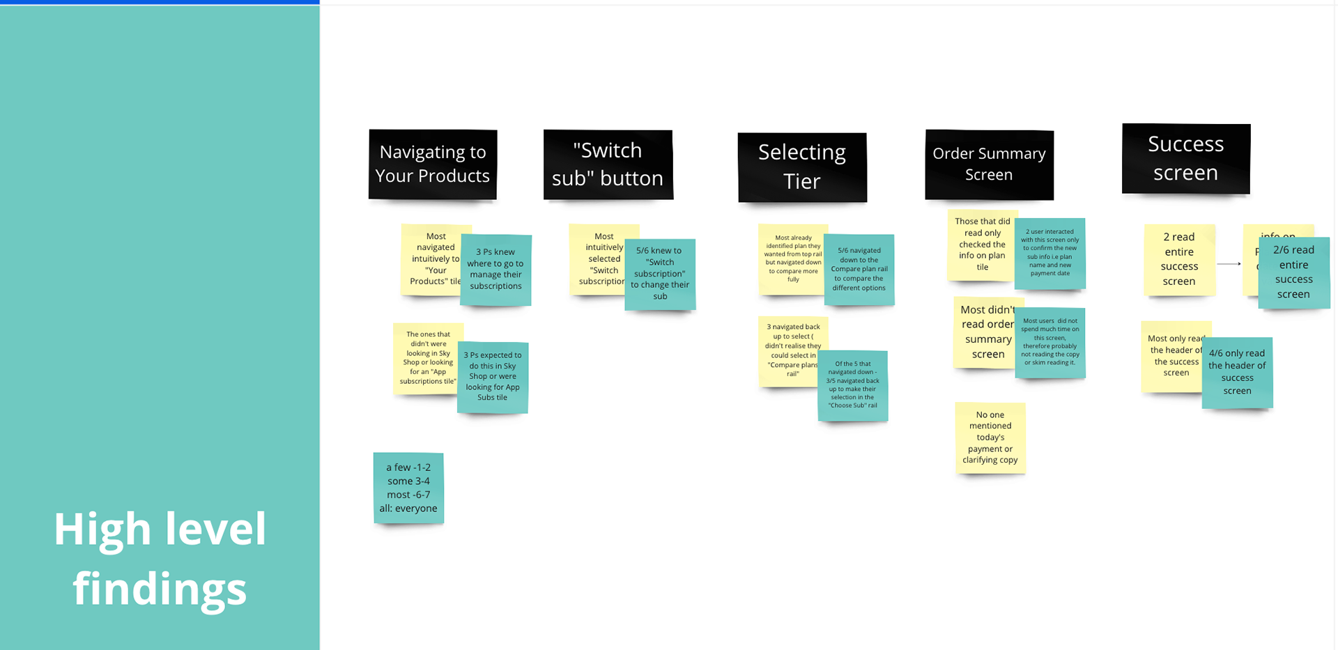
Executive Summary of Insights (Across all 3 studies)
Multi-tiers screen
"How do participants interact with this screen?" 🙁
85% made their selection from the first rail without navigating down to compare
The 15% that navigated down to compare, navigated back up and then selected their tier.
"How easy or difficult was it?" 😐
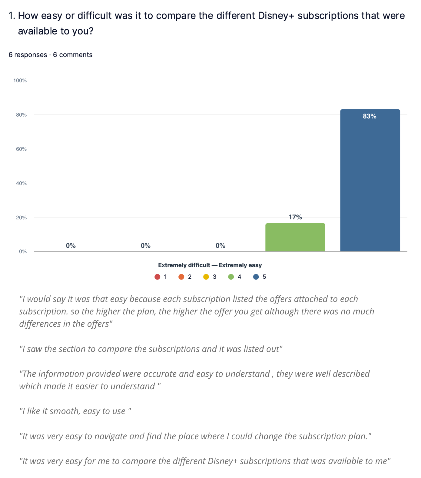
I had to caveat these responses
- Most chose based on price (from the top rail) so answers may have been solely based on price comparison.
The top rail is the primary decision point, even when comparison information is available
Order summary screen 😊
"Do customers need further clarification around Today's payment figure?"
90% skimmed through the order summary page (possibly due to the high cognitive load of the information presented).
However, when prompted to review it again, 80% of them understood why their payment for today would differ from their subscription charge.
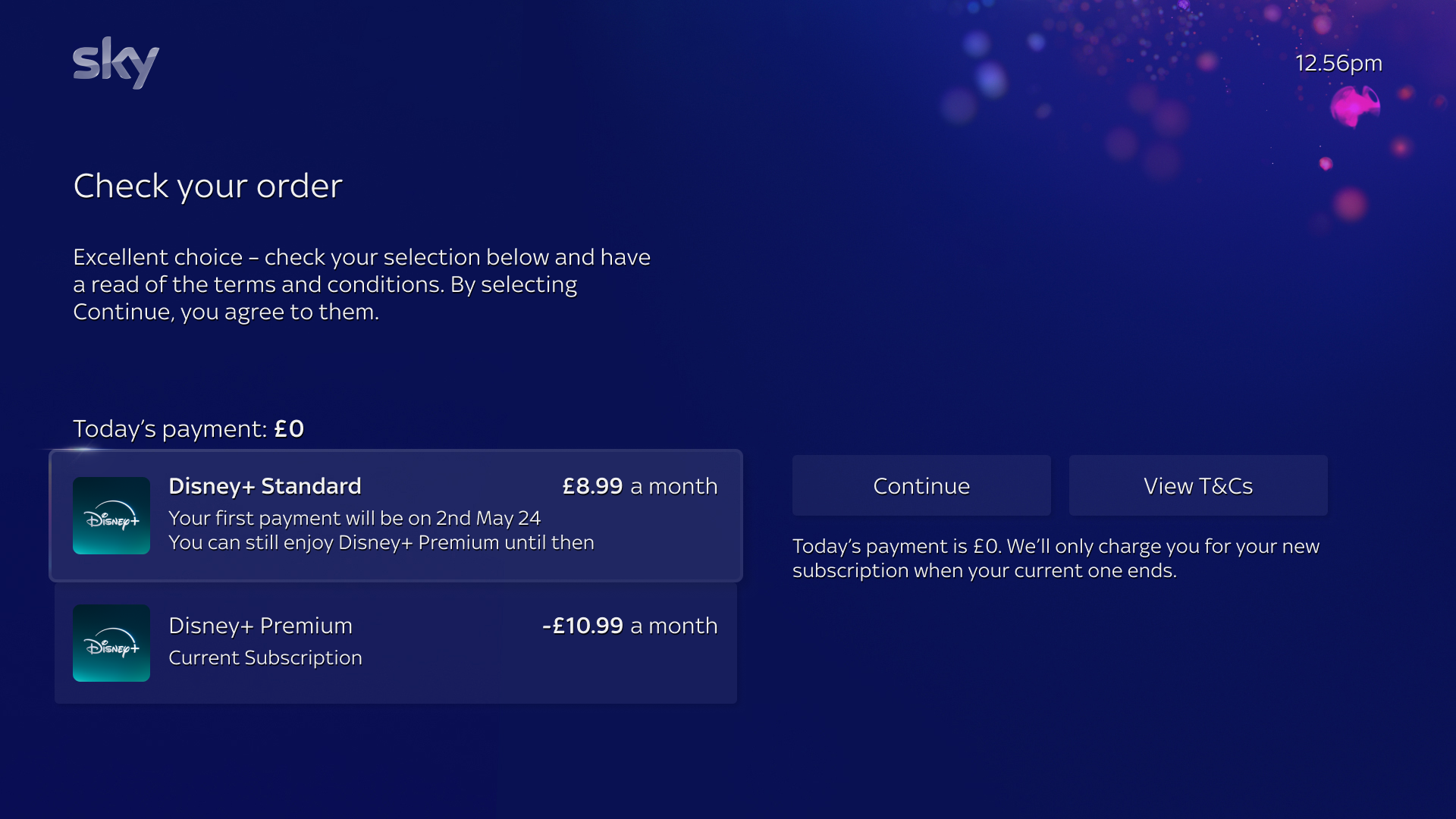
Clarity was present but not immediately surfaced in the initial scan of the Order Summary screen
Q-Legacy Intercept screen
"What is participant comprehension of their status?" 🙁
87% skimmed through this screen (only read the header and CTA label).
High cognitive load on the Q-Legacy intercept screen.
Refinement
After analysing the data, I presented research findings, user flows and recommendations to Product, Senior Leadership, and Commercial teams; using these session to align on insights, validate proposals, and refine the design direction based on feedback given.

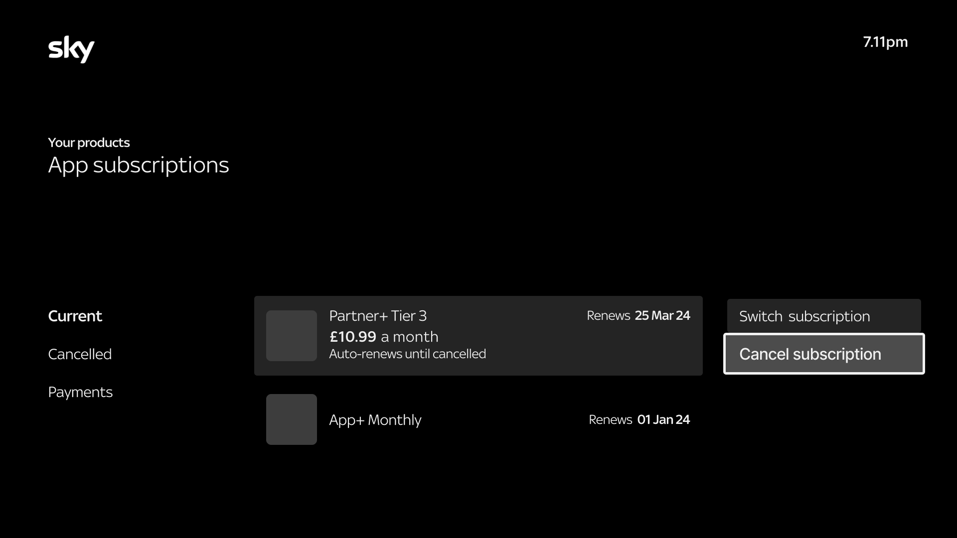
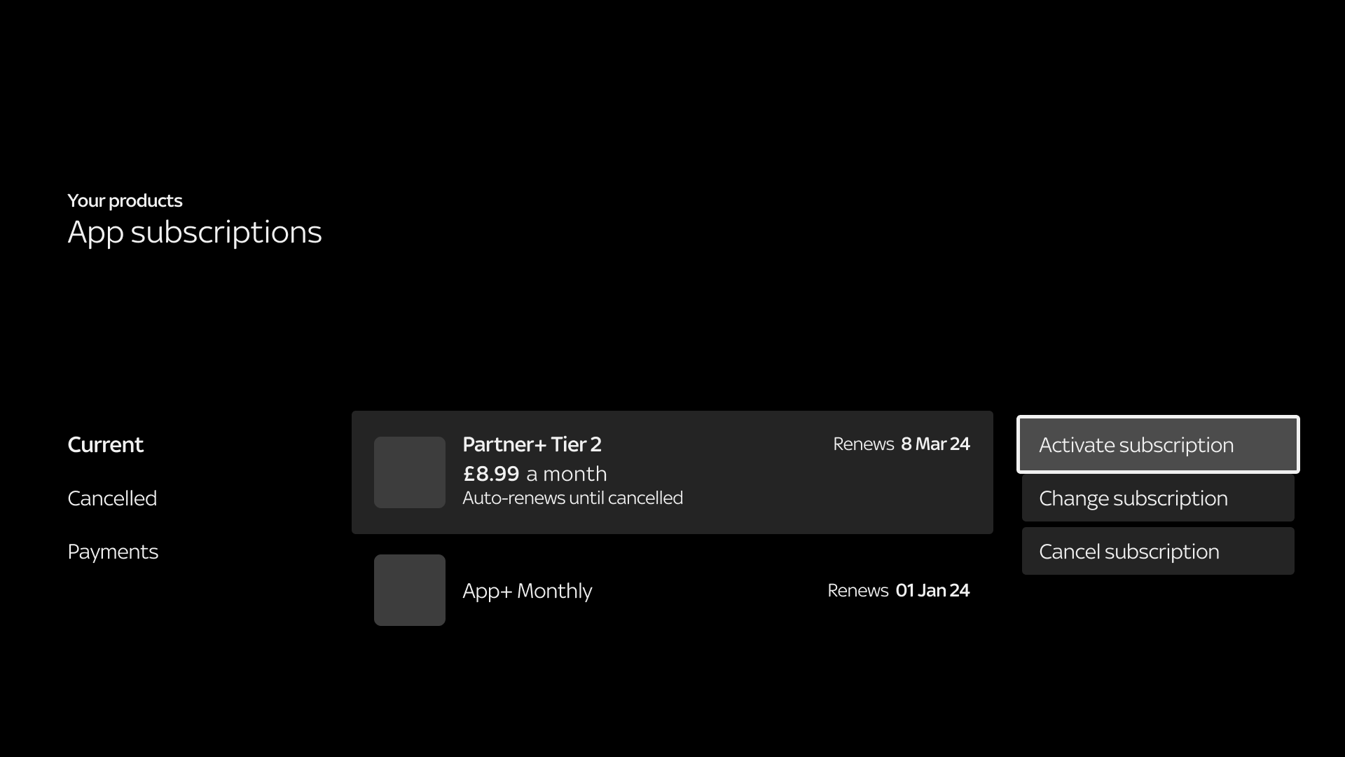
Amending Cancel subscription to Manage subscription
This was to give customers access to more actions available within the Your Products area (including Cancel subscription).
Although the feedback from user testing and presentations was mainly focused on the copy, I wanted to envision what the Multi-tiers page could look like if given the opportunity to revisit and update our Commerce templates in the future.
Future vision: Evolving the Multi-tiers experience
• A single rail that a customer can compare and select their tier from (no need to navigate down to look for additional comparison info).
• Adopting psychological pricing principles such as anchoring or social proof to help customers in their purchasing decision ("best value").
• Clear CTA to prompt action
- Second rail to showcase App Partner's content e.g. Discover Disney+ reinforcing the value of the subscription.

Future thinking Multi-tiers screen
Template constraints limited the scope of design changes, but I'm confident we delivered the best possible user experience within those boundaries.
My future-facing exploration have already laid the groundwork for ongoing conversations about template improvements; positioning us for more scalable, user friendly solutions down the line.
20 second video of the new functionality (Prospect customer)
REFLECTION
This project required deep stakeholder alignment, balancing business goals with legal, commercial and marketing input to deliver the strongest possible user experience within existing constraints.
Despite introducing more contextual journeys, activation rates saw only a modest shift; prompting a note for future research into user sentiment around activation.
Key takeaways
Challenging the status quo: Questioning the limits of our Commerce templates sparked conversation at the Senior Leadership level about the need for more scalable, flexible systems.
Scenario mapping at Scale: To manage complex edge cases, I developed a scenario mapping process that proved highly valuable to the Engineering team. It deepened collaboration with that team and led to invitations to their daily stand-ups and walkthrough of in-progress designs for me to QA. This template is now embedded in our department's design toolkit.