Project Overview
Background
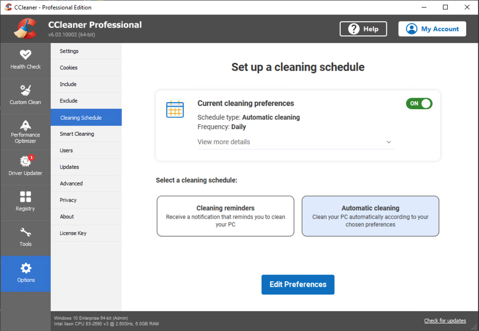
The Scheduler feature in the CCleaner desktop app enables users to automate PC cleaning.
I led this 8 month project from Nov 21 to Aug 22.
Customer Problems
• Low discoverability: User interviews showed customers wanted help 'keeping on top of their cleaning' and were surprised to learn the feature already existed. (Fitt's Law)
• Cognitive overload: Current scheduler offered too many choices, overwhelming users and slowing decision-making. (Hick's Law)
Business Goals
• Increase Sales opportunities: Position the Scheduler as a high-value engagement touchpoint to drive greater exposure and response to in-app sales messages.
Scope and Constraints
The Scope changed twice during the project.
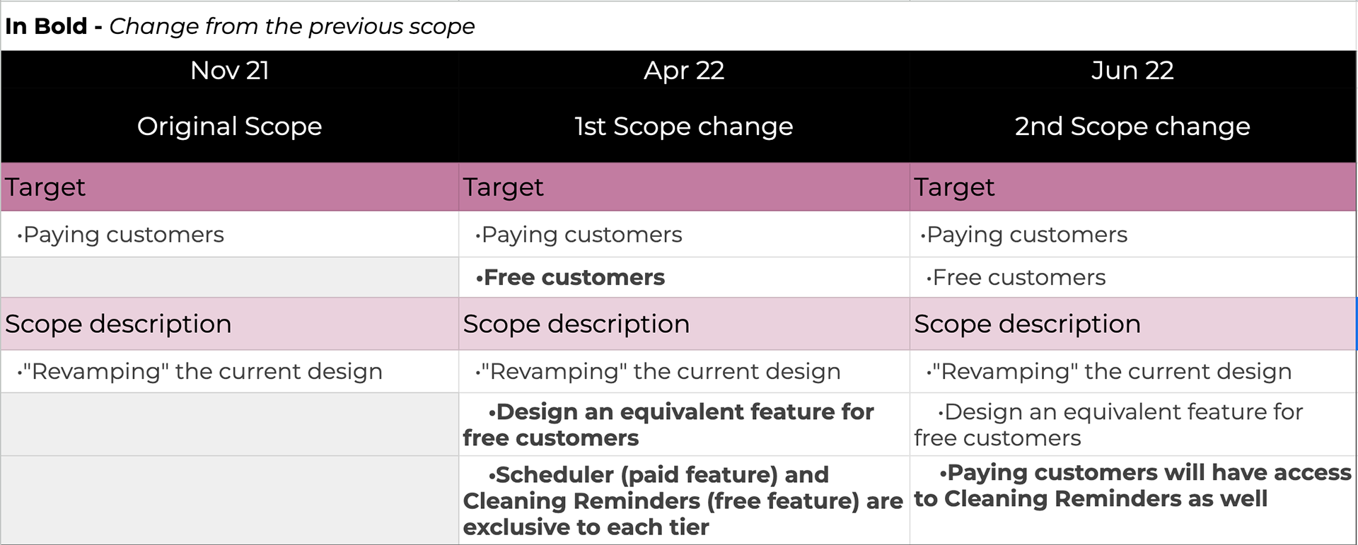
Constraints related to
• Technical: limited flexibility within the existing software framework.
• Data: available data only allowed analysis down to schedule frequency.
• Legacy design: existing schedule patterns risked incompatibility with the new system.
The Process
1. Discovery Phase - data sources, cognitive walk through, competitive research
2. Wireframes and validation
3. Introducing Cleaning Reminders
4. Integrating both features and validation
5. Accessibility
Success Metrics
We adopted the H.E.A.R.T framework retrospectively. Midway through reviewing outcomes, I realised our success metrics were heavily business-focussed, with no measures for UX quality.
I discovered the Google H.E.A.R.T framework, fell in love with it's user-centred metrics and presented it as a forward-looking approach for future projects. It was well received and I secured buy-in from the team.

** Retention wasn't a focus because once a user had set a cleaning schedule there was little likelihood of them returning to the feature again.
Results
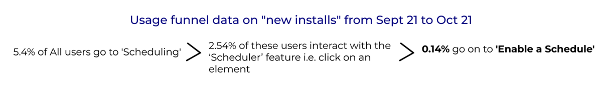
Within 2 months after release
• Engagement: 21% Increase in New installs who "Enabled a schedule" (previously at 0.14%).
• Adoption: 5.4% increase; driven mainly by Upgrades activation (previously at 0.05%) Trial flows didn't exist in the previous feature so no basis for comparison.
• Churn reduction: Rolling 30 day churn dropped by 2% (previously at 17.01%).
The Process
Discovery Phase
I began by partnering with the Data team to understand how customers currently engaged with the Scheduler feature.

Findings confirmed that few new customers discovered it - aligning with prior user interviews where participants expressed a need for a feature to help them schedule a clean and surprise that it already existed.
Next, I conducted a cognitive walk through to evaluate the learnability of the feature for new users.
The Scheduler homepage immediately felt overwhelming with an excess amount of information competing for attention.

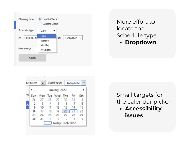
In addition, the whole schedule creation flow took place on one screen further contributing to cognitive overload.
There was also minimal guidance to help users distinguish between cleaning types; Health Check and Custom Clean.
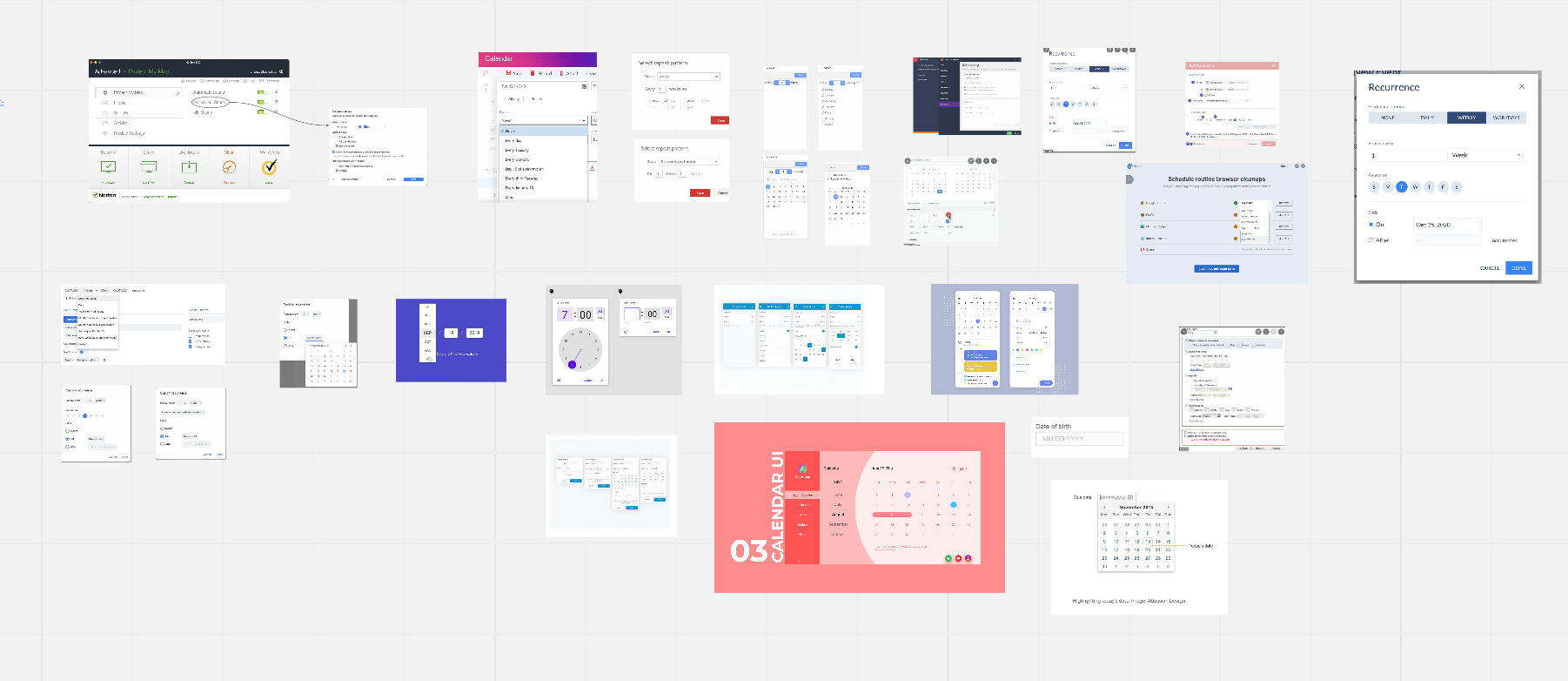
I conducted desk research into how other products approach scheduling task, gathering patterns and best practices. I also invited the team to share examples from apps they personally use for scheduling, expanding out pool of inspiration.
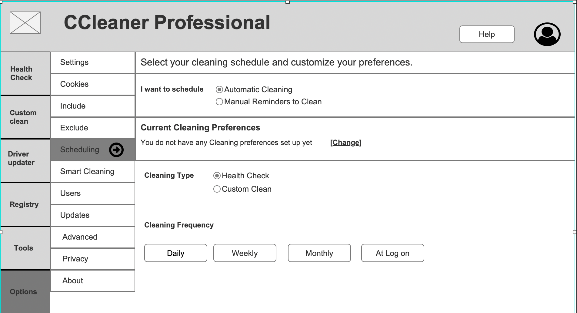
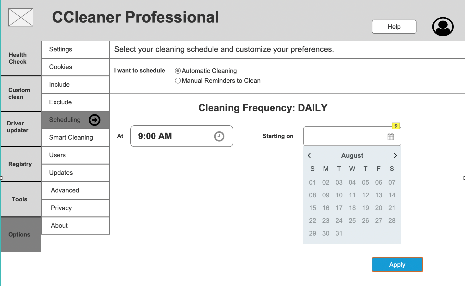
Wireframes & Validation
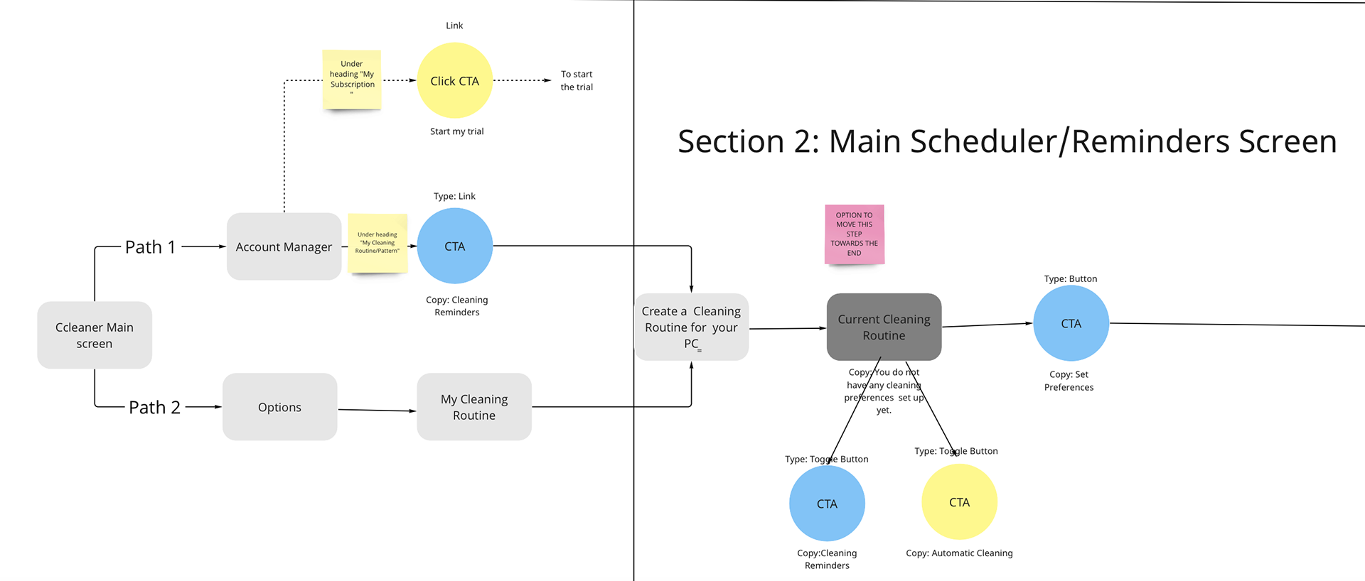
The original feature's single-screen set up concentrated too much information at once, increasing cognitive load. I restructured the flow across multiple screens to create a more focussed, digestible experience.
This was reflected in the updated user flow.
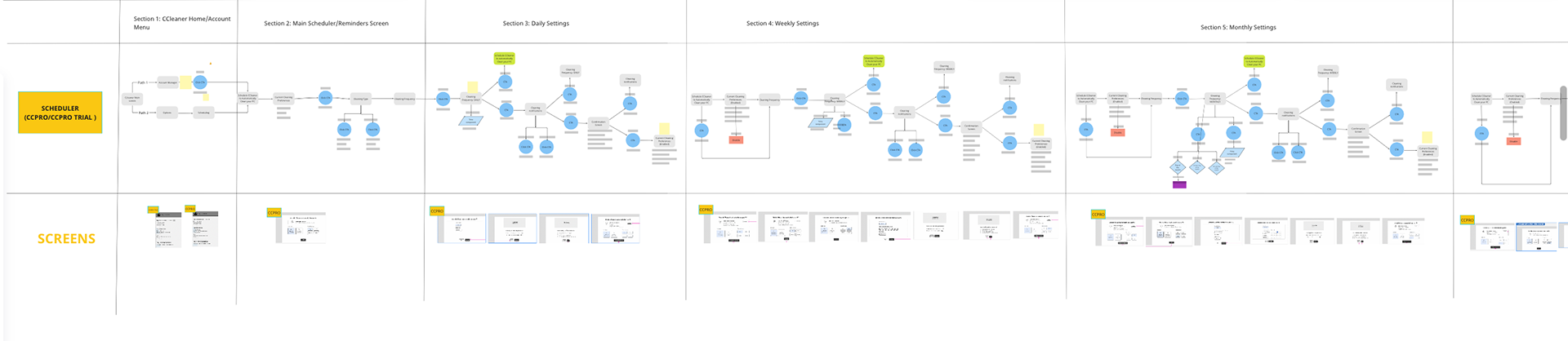
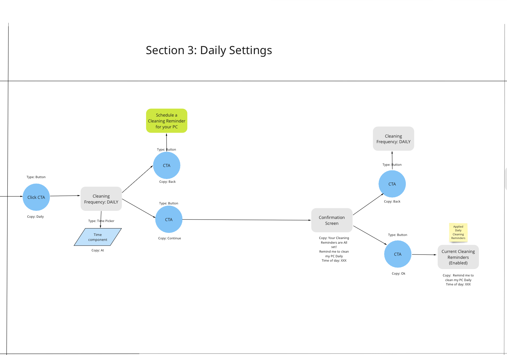
Scheduler User flow

Close up of Scheduler User flow - Main Scheduler screen and Daily settings
After aligning with stakeholders (i.e. PM, Developers and the Product Designer) on the user flow, I created the wireframes and tested the usability of the flow with Usability Hub.
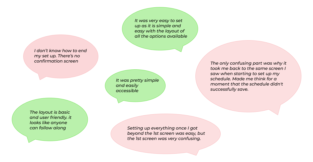
Usability testing feedback
-Only 12% of participants could complete the steps needed to set up a cleaning schedule (in this case Daily)
Further work needed to simplify and clarify.
The original flow lacked user feedback to the user during the scheduled clean; a missed opportunity to reinforce value. I introduced real-time feedback to highlight the clean's impact and increase perceived benefit.

1st round of testing: Feedback from Usability Hub participants
Introducing Cleaning Reminders
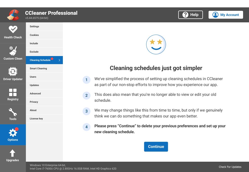
A week before release, the scope expanded to include a new Reminders feature for CCleaner Free users.
This sudden change exposed communication gap, so I initiated and faciliated an ad-hoc retrospective to align the team. Together, we agreed to create a detailed Product Spec doc to capture all decisions; replacing high-level briefs as a single source of truth.
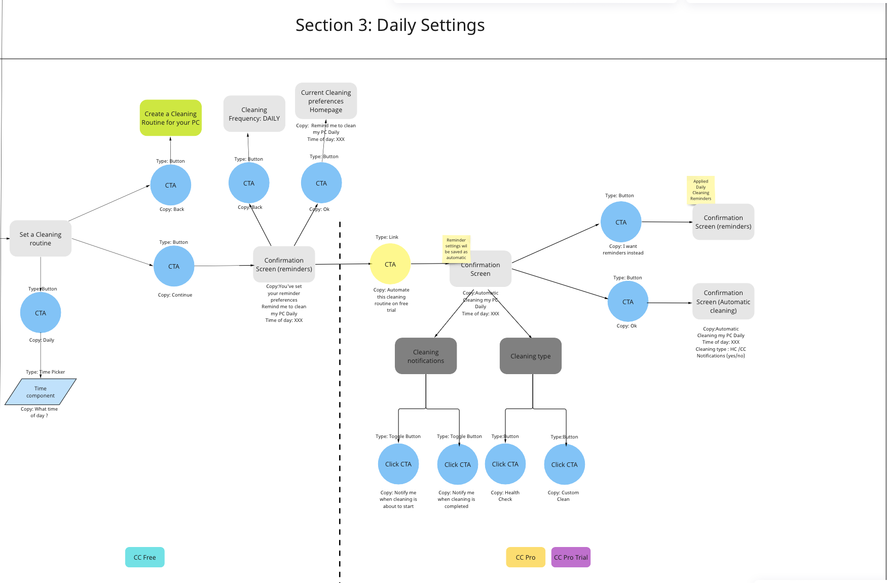
I updated the user flow to incorporate the new feature.
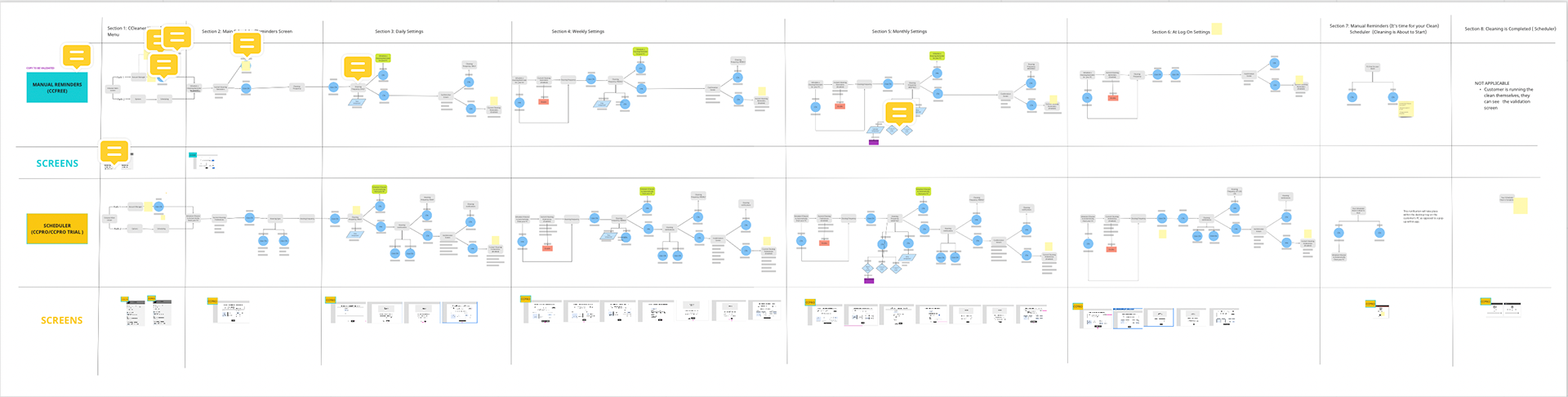
Reminders and Scheduler user flows
Close up of Reminders Daily flow
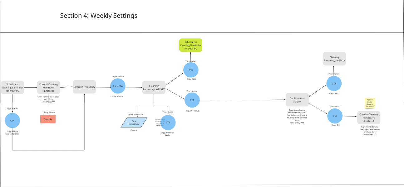
Close up of Reminders Weekly flow
There were some overlaps with the Automatic Cleaning feature allowing me to incorporate relevant Usability hub feedback in to the Reminders design.
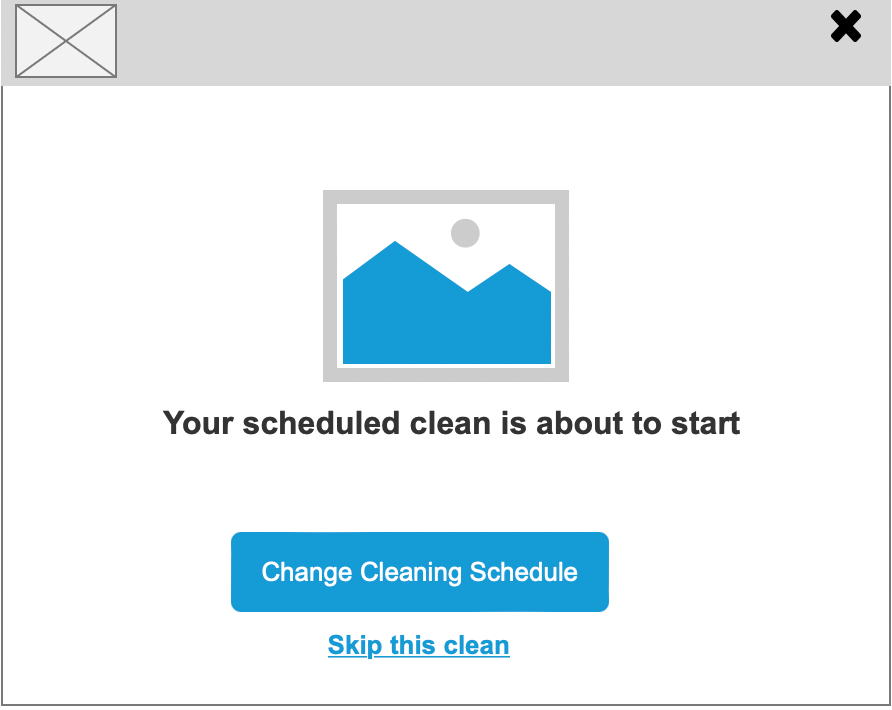
However, elements such as Cleaning notifications (Cleaning is about to start/has finished) and Cleaning type (Health Check/Custom Clean) were excluded as Reminders were about prompting the user to initiate the clean themselves.
Further reduce cognitive load by designing the feature homepage just for 'confirming' and 'editing' cleaning preferences.

Integrating Both Features and Validation
A late scope change required that each feature would no longer be exclusive to their respective tiers.
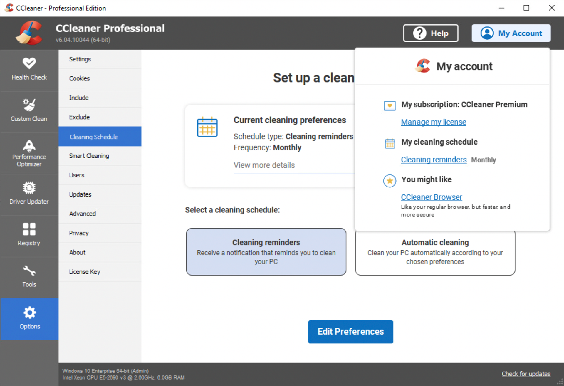
I remapped the User journey to ensure Free users could discover the automated feature in their version of the app, while enabling Paying users to choose either option (Automatic Cleaning or Cleaning Reminders) when setting a schedule.
Both features were surfaced on the homepage, with Automatic Cleaning accessible to Free users via a trial or upgrade to CC professional.
Short, clear descriptions distinguished the 2 options, reducing confusion and supporting informed decision-making.

CC Free customer view

CC Professional Customer view
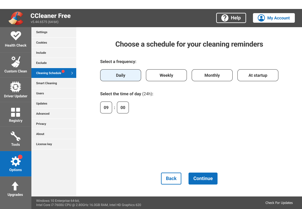
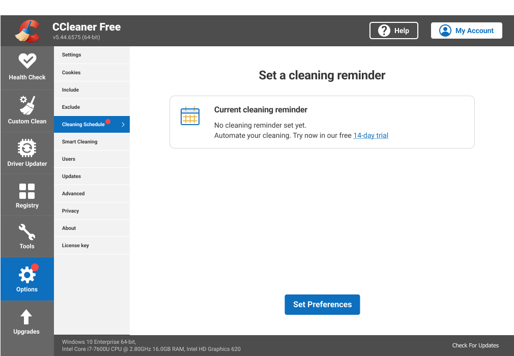
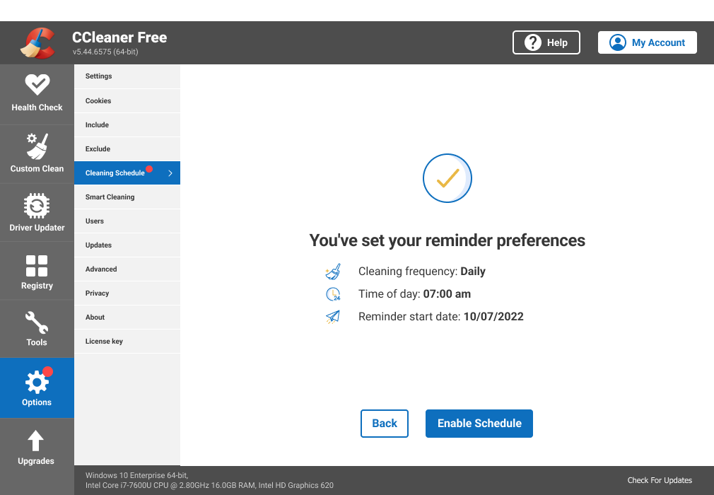
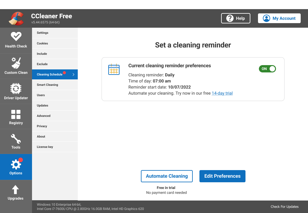
Daily Cleaning Reminders

Daily Automatic cleaning
Automatic Cleaning notifications can be switched on and off.
This was to grant the user more control over their notifications.
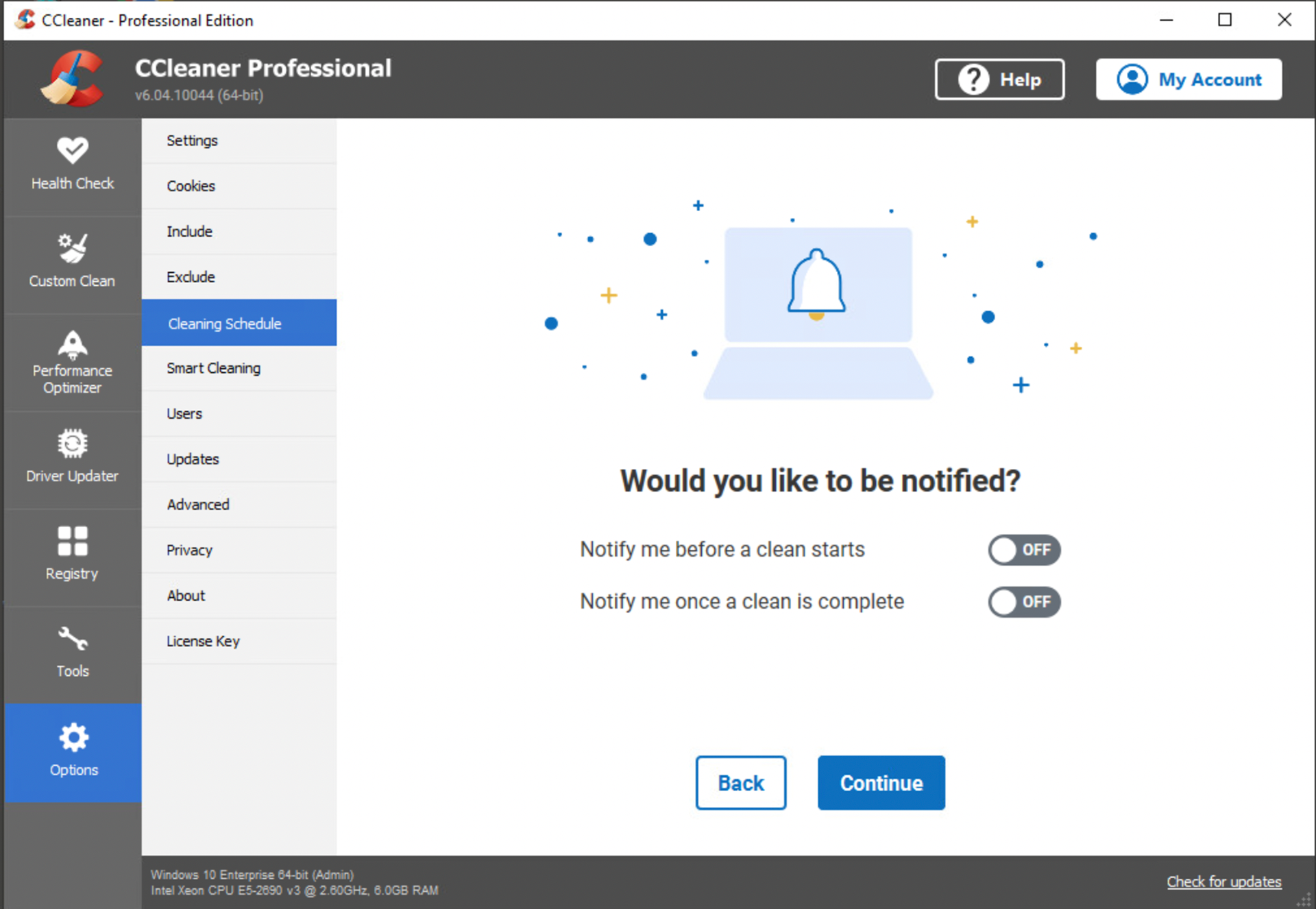
Automatic cleaning notifications
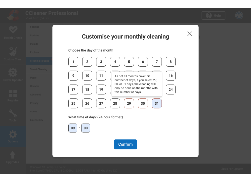
Monthly calendar days
A prompt for the user that not all months had days 29, 30 and 31
Previously, if a Monthly-on-Day 31 pattern was scheduled, the clean would only run on months with 31 days (with no feedback to the customer)
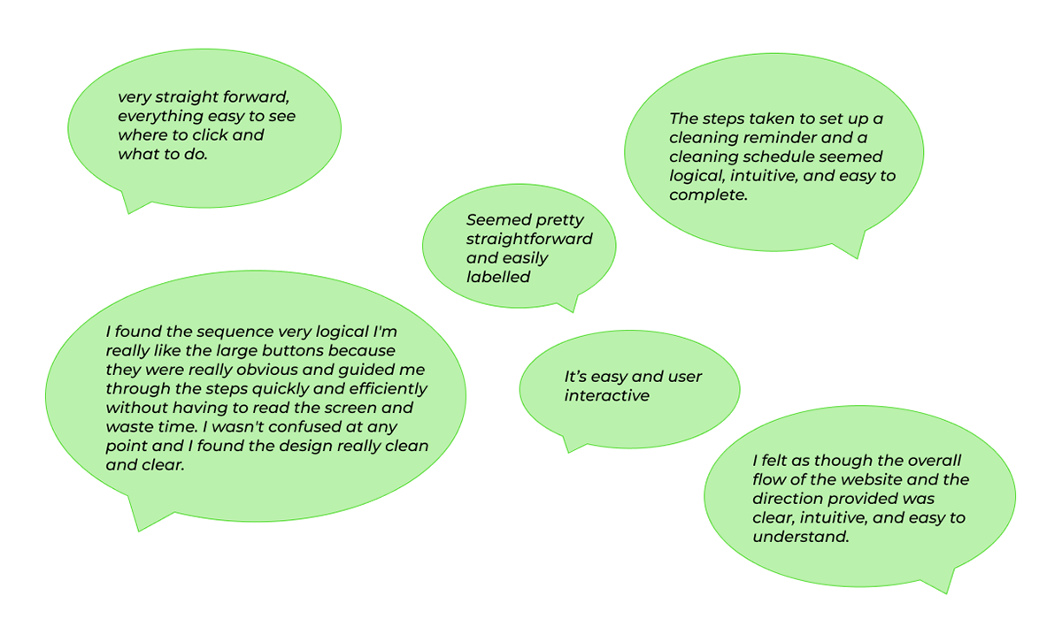
2nd round of testing: Feedback from Usability Hub participants
To increase feature visibility, I added a link within the My Account area. In prior usability testing for My Account, participants ranked "New features" as 3rd most useful item they wanted to see, making this a strategically aligned placement.
Edge case scenario
A small subset of CC Professional customers (2%) had legacy scheduling patterns incompatible with the new design. While a minor segment, I prioritised managing their expectations to maintain a user-centric experience and minimise disruption.
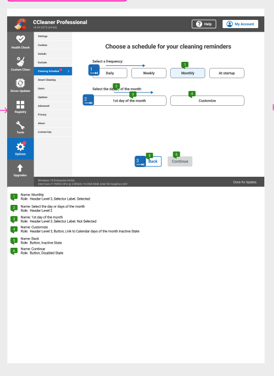
Accessibility
I annotated the Bluelines for the final designs so our screen reader and keyboard only users could also benefit from the feature.


Reflection & key takeaways
This project was marked by significant scope changes, underscoring the need for a holistic and integrated approach. In hindsight, I would have pushed harder to merge Automatic Cleaning and Cleaning Reminders, aligning with how other app features operated
• Lockdown those UX metrics (EARLY): A massive learning curve for me as my previous projects had only been evaluated in terms of revenue added. User- centred metrics are also needed to evaluate the value added by a UX improvements.
• Maintaining a flexible and dynamic approach: Leveraging overlaps between related features allowed me to adapt quickly and maintain momentum despite the scope changes.