Project overview
Background
Paramount+ aimed to boost activation rates for their Marketplace subscriptions on EntOS (Entertainment OS). The proposed solution allowed customer to pre-fill account details by sharing their Sky linked email address.
This was a 14-month project.
Customer problems
• Friction: current account creation process takes place across multiple platforms (Web & TV).
• Keyboard input: existing research revealed that customers found on-TV account creation "painful and long".
Business Goals
• Increase activation rate: currently only 39% of new Paramount+ customers activate their accounts on the day of purchase.
• Onboarding new partners: an agnostic solution to be rolled out to other partners.
Scope and Constraints
Scope was mainly Prospect (New Customers) and Resubscribing (Unactivated customers).
Constraints related to
• Partially created account: starting point would be to only require an email address to partially create their account.
The Process
1. Brief analysis and AS-IS Journey
2. Competitor analysis
3. Exploring design options
4. Moderated user testing
5. Balancing user insights and business constraints
Success Metrics
• Activation rate
• % of accounts created using Sky-verified email vs operator-verified email address
Results (8 weeks post launch)
• Activation rate: Boosted to 53%.
• % of accounts created using Sky-verified email vs operator-verified email address: 65% of customers who activated on purchase date had opted to share their Sky email address; the remainder activated online.
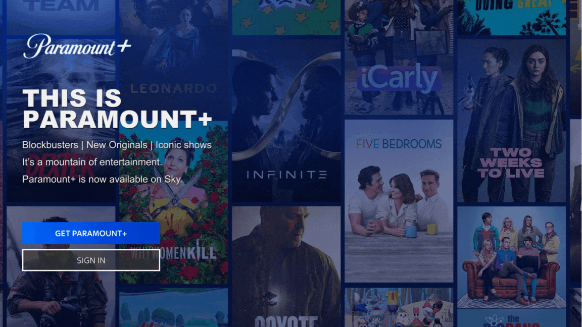
New Account creation
Original Account creation
The Process
AS-IS journey
I began by looking at the current experience and validating key pain points.
The main pain point being the split account creation flow across TV and web.
Current experience
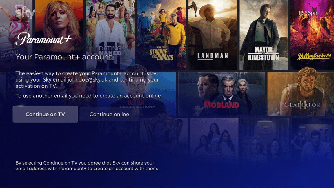
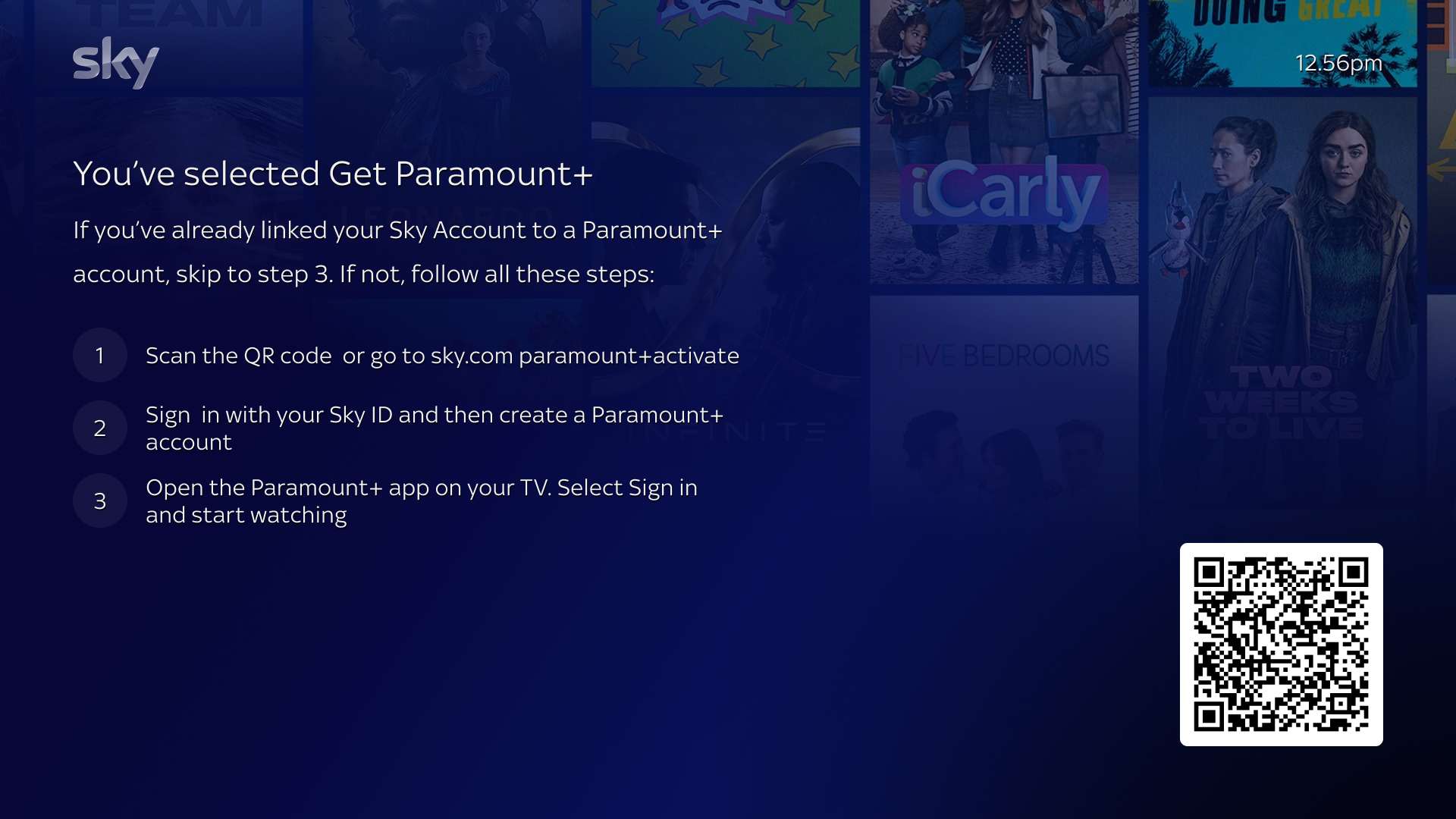
After purchase; customers are presented with a QR code which takes them to sky.com to create their partner account - introducing friction at a critical moment in the journey.

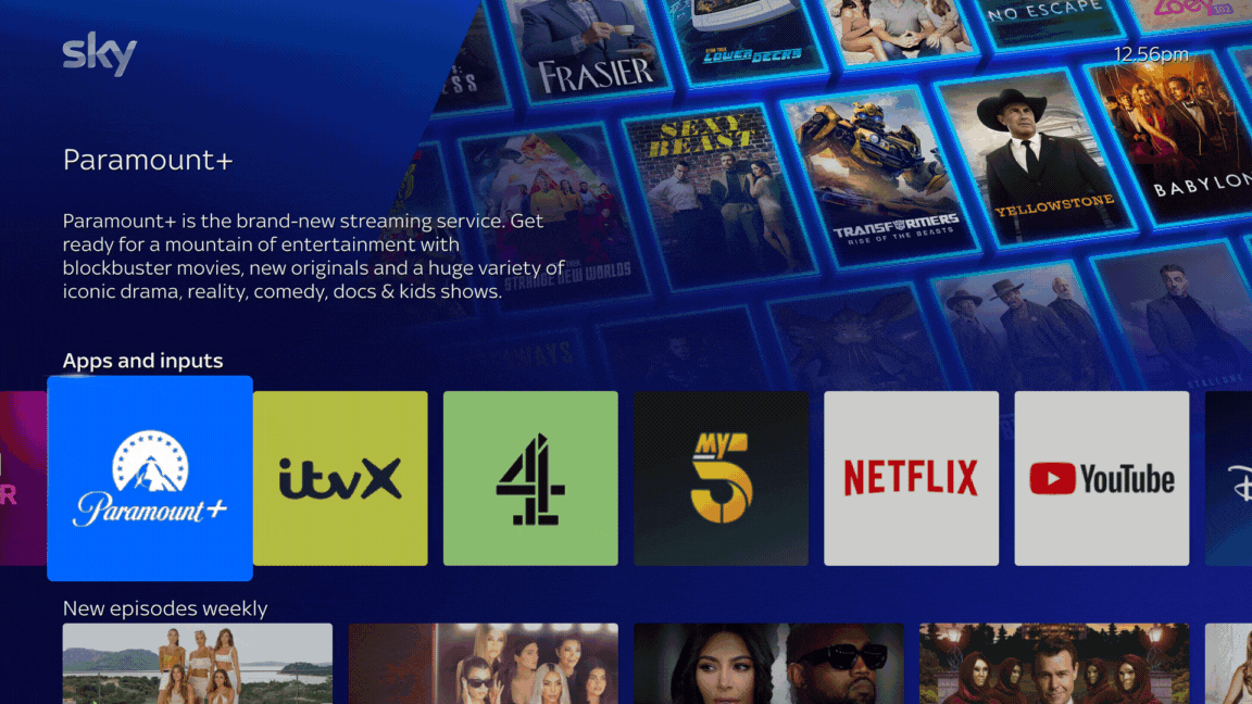
Once the account is created on web, customers must return to the TV, manually locate the partner app (e.g. Paramount+) and then sign in either via Web or on TV.
This adds unnecessary effort before content access.
This adds unnecessary effort before content access.
Quite a lot of hoops for our customers to jump through just to watch their content 🤯
Prior research revealed mismatches between user expectations and reality:
• Account creation took longer than expected (15 mins vs 5-10mins)
• Participants expected that "Sign-in on TV " meant they could only watch on TV (No, It meant they could watch on any device).
• Participants struggled to remember the account creation instructions on the QR code screen (they frequently had to refer back to the TV to check instructions).
These insights highlighted the need for a simplified flow that would align with our customer expectations.
How do others approach activation?
The friction point arises at partner app activation (e.g. Paramount+, Hayu), where users need to leave Sky’s environment to complete setup.
I looked at a range of comparable platforms to map how and when they prompt customers to create accounts or activate partner subscriptions:
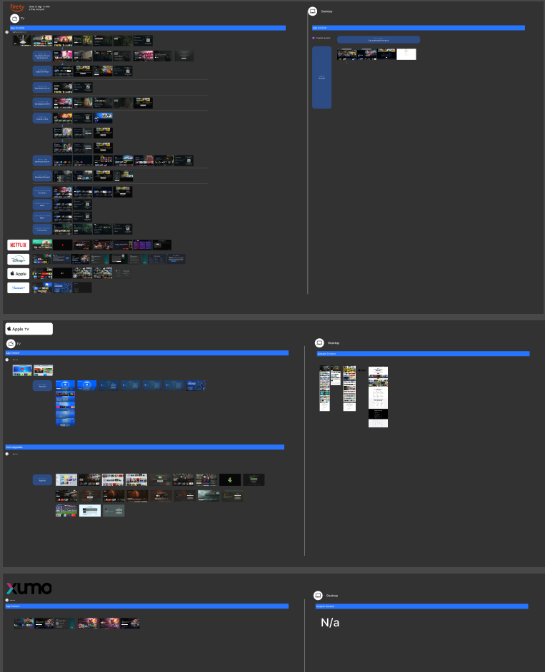
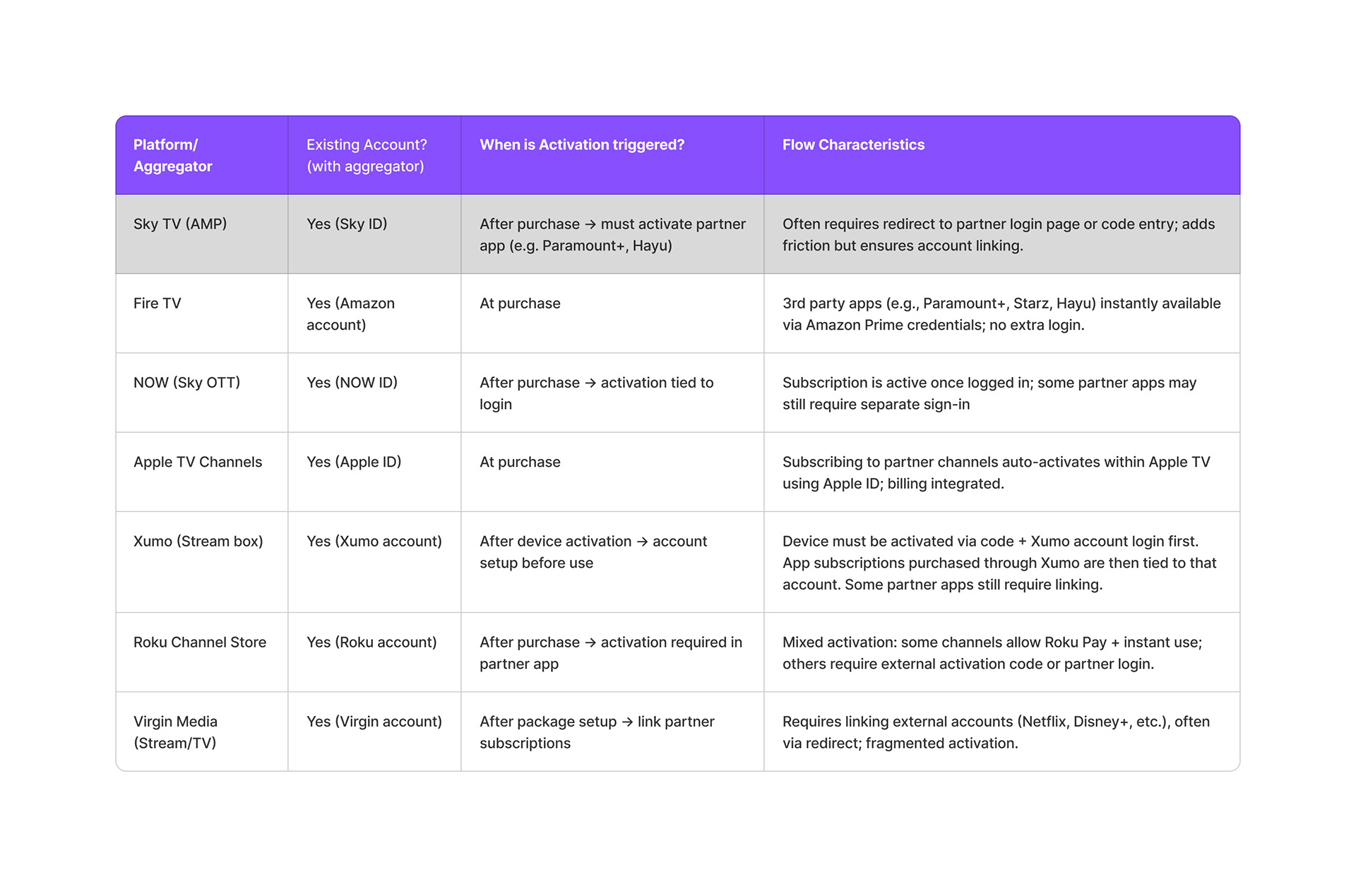
Benchmarking summary
Patterns observed
• Seamless (Amazon, Apple): One account, one billing system. No additional steps.
• Semi-Seamless (Sky, NOW, Roku, Virgin): Purchases occur in-platform, but activation requires partner sign-in.
• Device-Coupled (Xumo): Device activation is mandatory upfront; high control, higher friction.
• Device-Coupled (Xumo): Device activation is mandatory upfront; high control, higher friction.
Implications for Sky
Sky currently mirrors the semi-seamless group; effective for partner identity, but at the cost of user effort. The Amazon/Apple model shows the competitive advantage of fully managed activation, while Xumo illustrates the risks of front-loading setup.
Opportunity: Sky customers already hold a Sky ID that comprises an email address. This could help evolve toward an activation model that retains partner integrity but reduces unnecessary redirects, positioning Sky closer to the seamless standard.
Exploring design options
"How might we help customers unlock Partner content on TV seamlessly?"
I mapped 2 proposed options and shared them with Product and the wider design team.
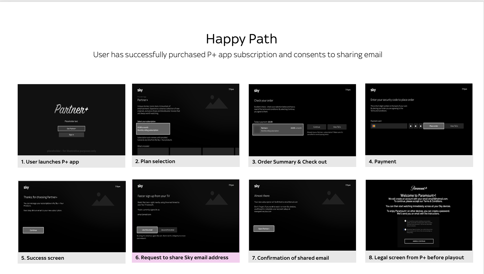
Proposal 1: Offer 2 points for customers to share their Sky email address (pre- and post-purchase)
Rationale: Prompting before purchase aligns with common mental models seen in apps where account creation typically comes before subscription (Jakob's Law).
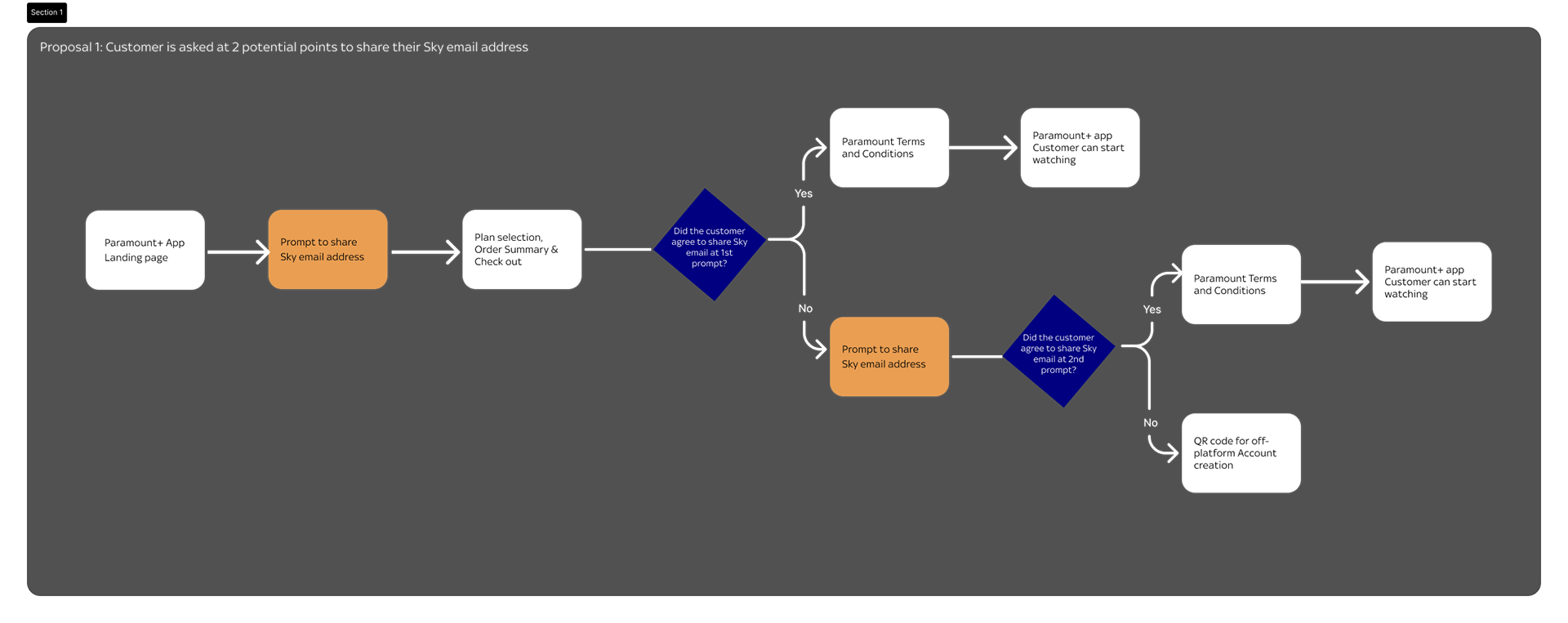

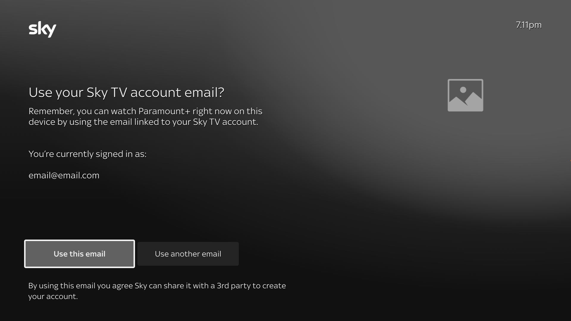
Prompt 1 to share email address
Both CTAs allow the customer to progress to purchase
"Skip for now" however triggers the 2nd prompt post purchase
Prompt 2 to share email address
"Use another email" activates the QR code route (current experience)
Pros
• Reduces perceived friction; making account creation feel faster.
• Scalable for future Partners requiring more data (e.g. DOB, location)
• Minimises drop-off by letting customers proceed even if they skip the first prompt.
Cons
• Weak mental model alignment: customers may not link Sky email input with account creation.
• Timing sensitivity: some users may be in a browsing mindset so not yet ready to share their details.
Proposal 2: Prompt customers to share their Sky email after purchase only.
Rationale: This aligns with the existing journey and reinforces the current customer mental model, reducing the risk of confusion or hesitation.
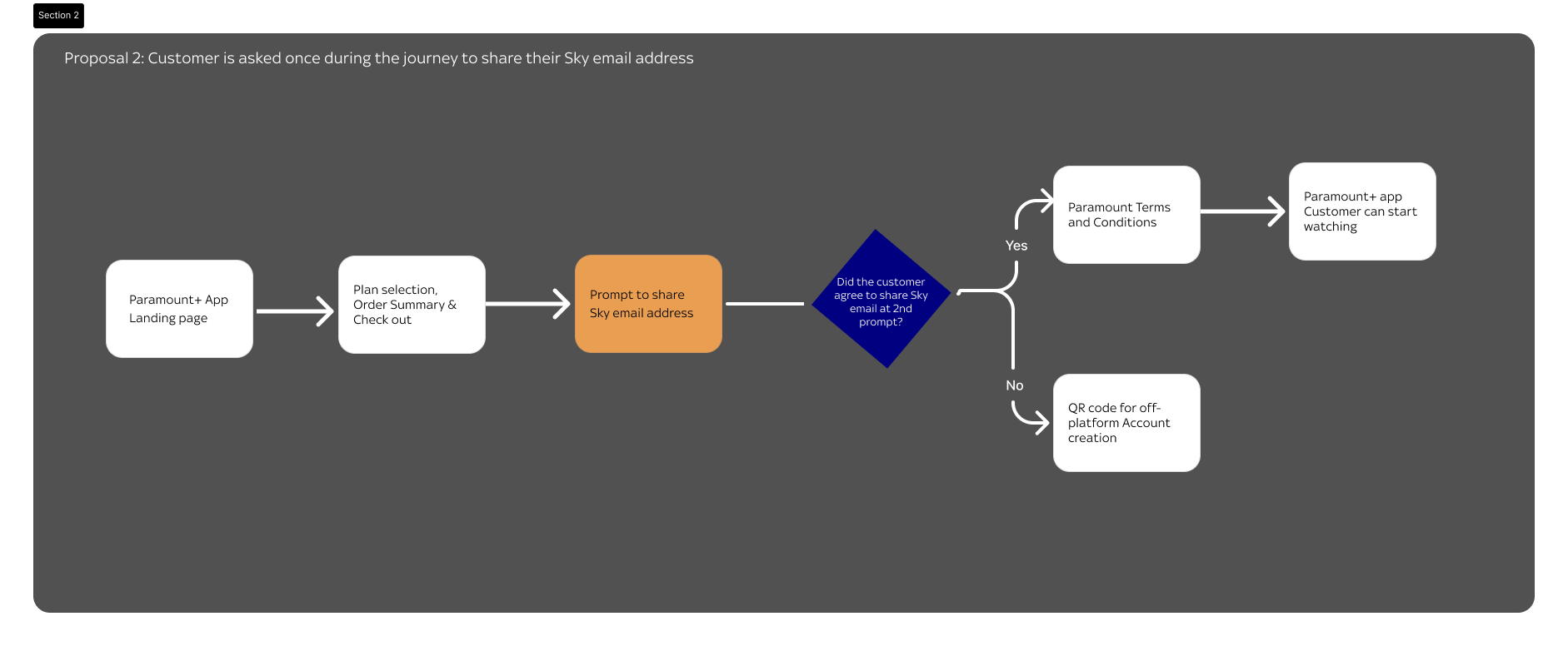
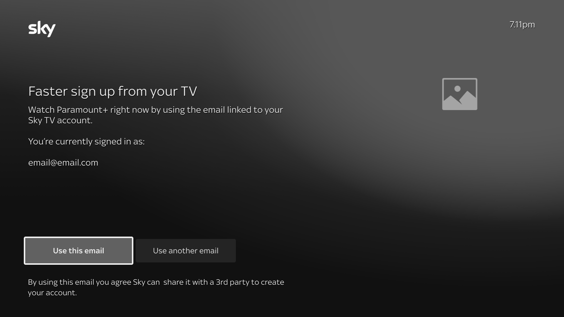
Customer asked once after purchase
"Use another email" activates the QR code route (current experience)
Pros
• Contextual timing: Asking after purchase feels more natural and relevant.
• Mental model alignment: Preserves the familiar EntOS and reduces friction.
Cons
• Higher perceived effort: account creation may feel longer when delayed.
• Limited scalability: less suited for partners needing more upfront data.
Below is a visual comparison of both proposals.
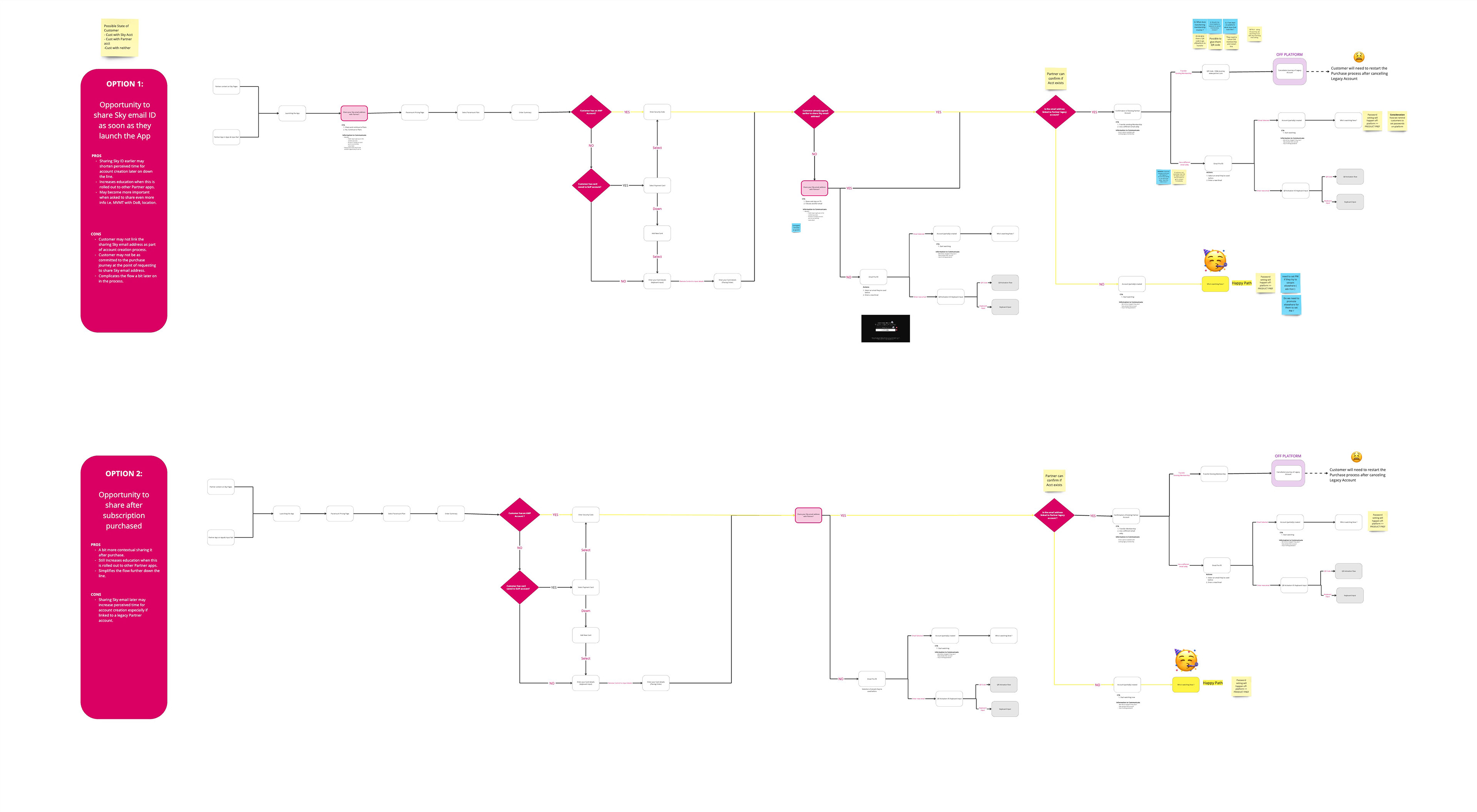
Proposal 1 was favoured by the project team for its scalability, especially for Partners needing upfront data like DOB.
Engineering initially raised concerns about technical feasibility, particularly EntOS limitations. I led a clarification session with Product and Engineering confirming that Sky would pass customer details to the Partner, who would complete account creation.
With alignment across teams, we proceeded to moderated user testing for Proposal 1.
Or so we thought, until the project was descoped for 2 months.
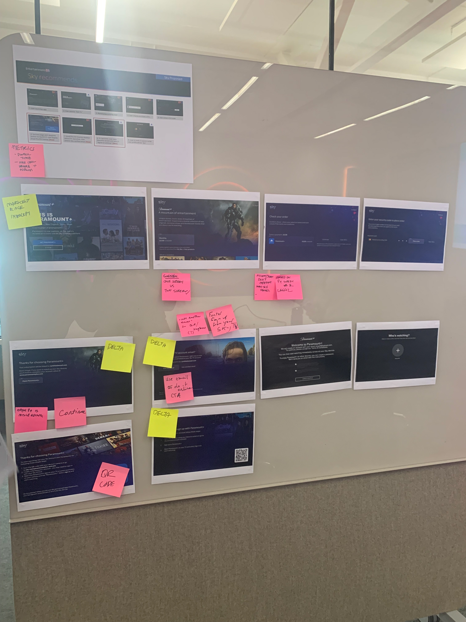
Moderated user testing (2 months later)
The project picked up pretty rapidly and changes in our Research team meant there was a tight 10-day turnaround for planning, recruitment AND testing. This meant clear, transparent communication was critical.
To support this, I co-designed a cross-disciplinary UXR kickoff workshop; aligning the Researcher with our goals and refining participant recruitment criteria through collaborative feedback.
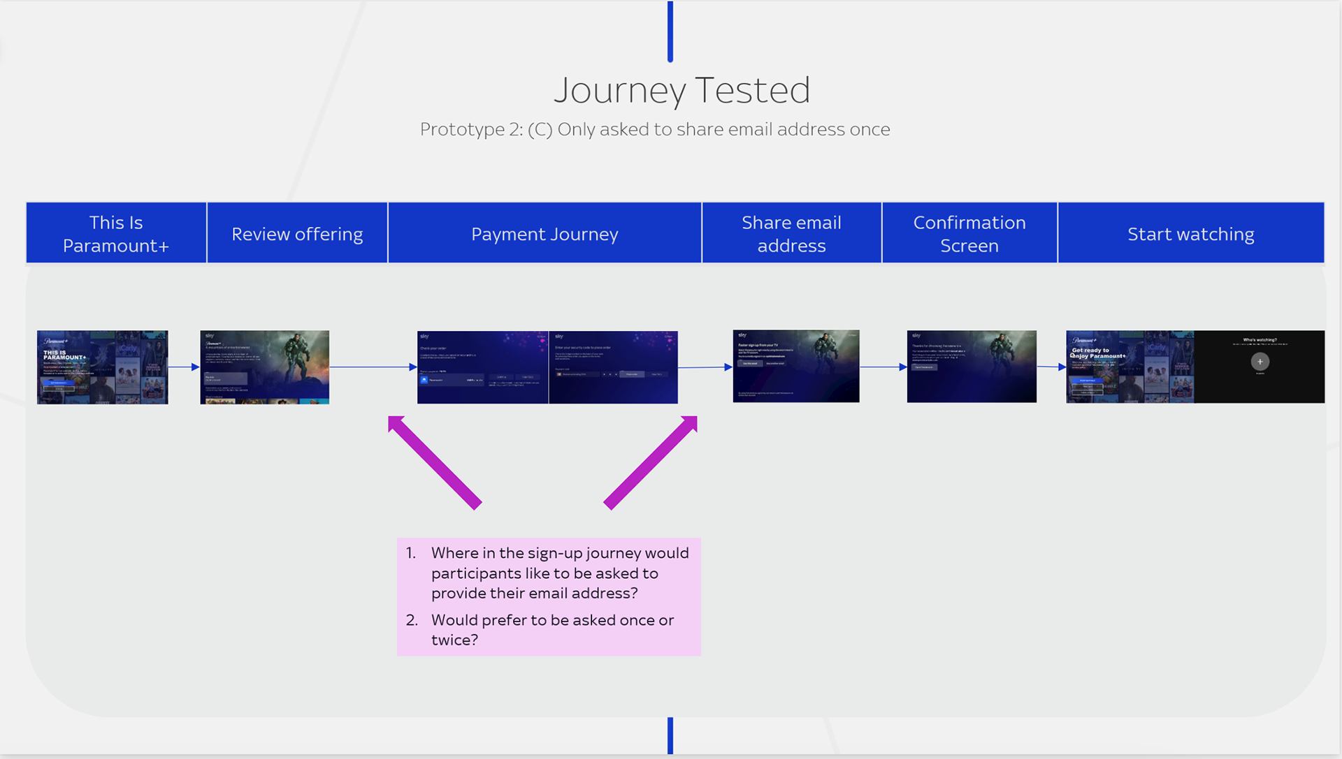
Based on this, the recommendation from Research was to also test Proposal 2 along with Proposal 1 to test our assumptions.
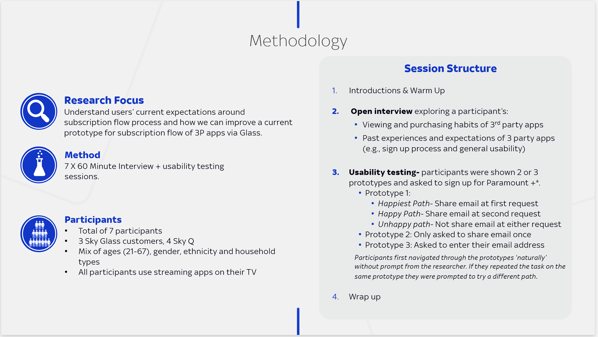
The workshop also created a space to build upon our research questions and testing hypotheses.
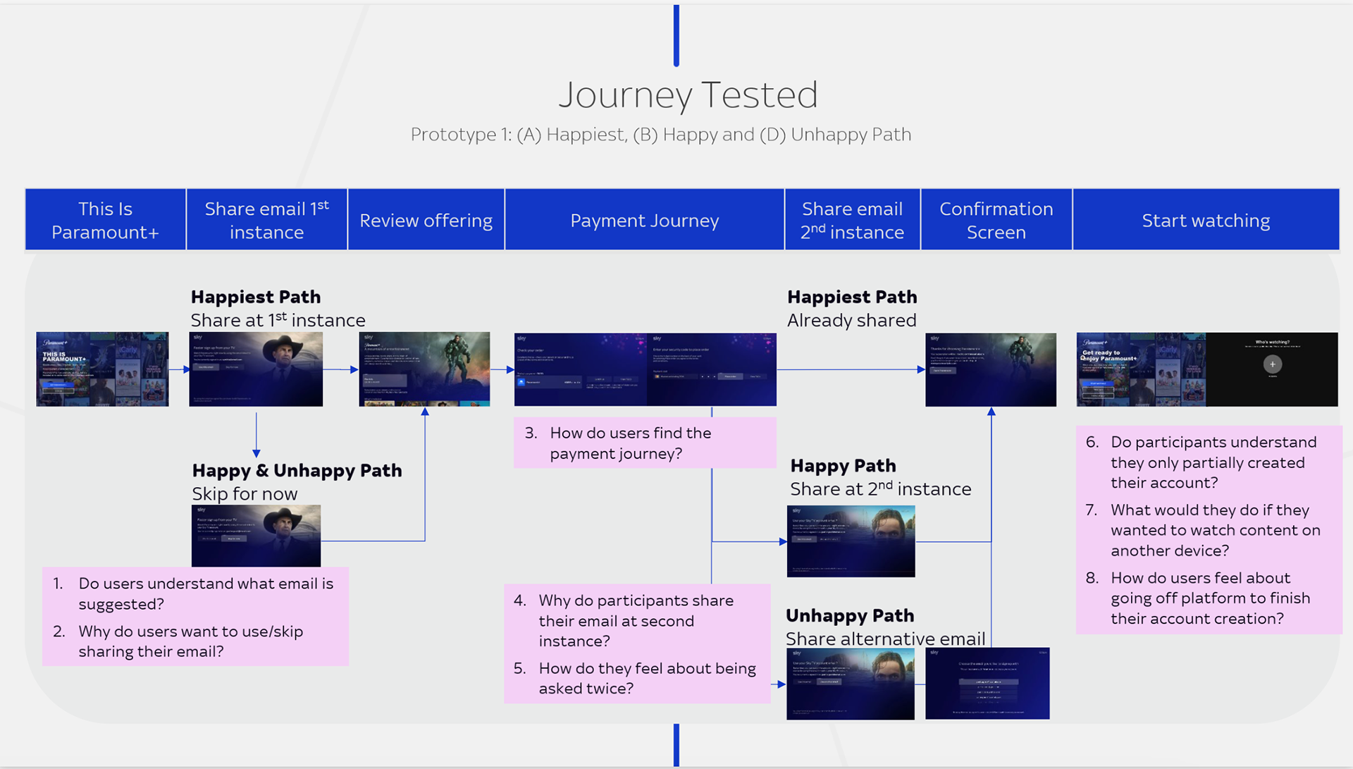
Executive summary across both journeys
• Account clarity was low: Participants were unsure if they were "signed in" to Sky or Paramount+.
• Most understood that the email came from their Sky account, but some didn't realise they'd still need to set a password for non-TV access.
• Participants preferred to share their email after reviewing the offer but before payment.
• There was a clear need to separate the purchase journey from account creation, both in flow and messaging.
• Reactions to a 2nd email prompt were mixed (some appreciated the confirmation, others found it repetitive).
🚨New Requirement Alert 🚨
Post-testing, Paramount+'s legal team mandated an extra screen before content access to manage the account creation process.
We had already addressed this with carefully crafted copy, but I co-facilitated a workshop with the Product Manager to align on integrating the new screen while incorporating testing insights.
Balancing User insights and Business constraints
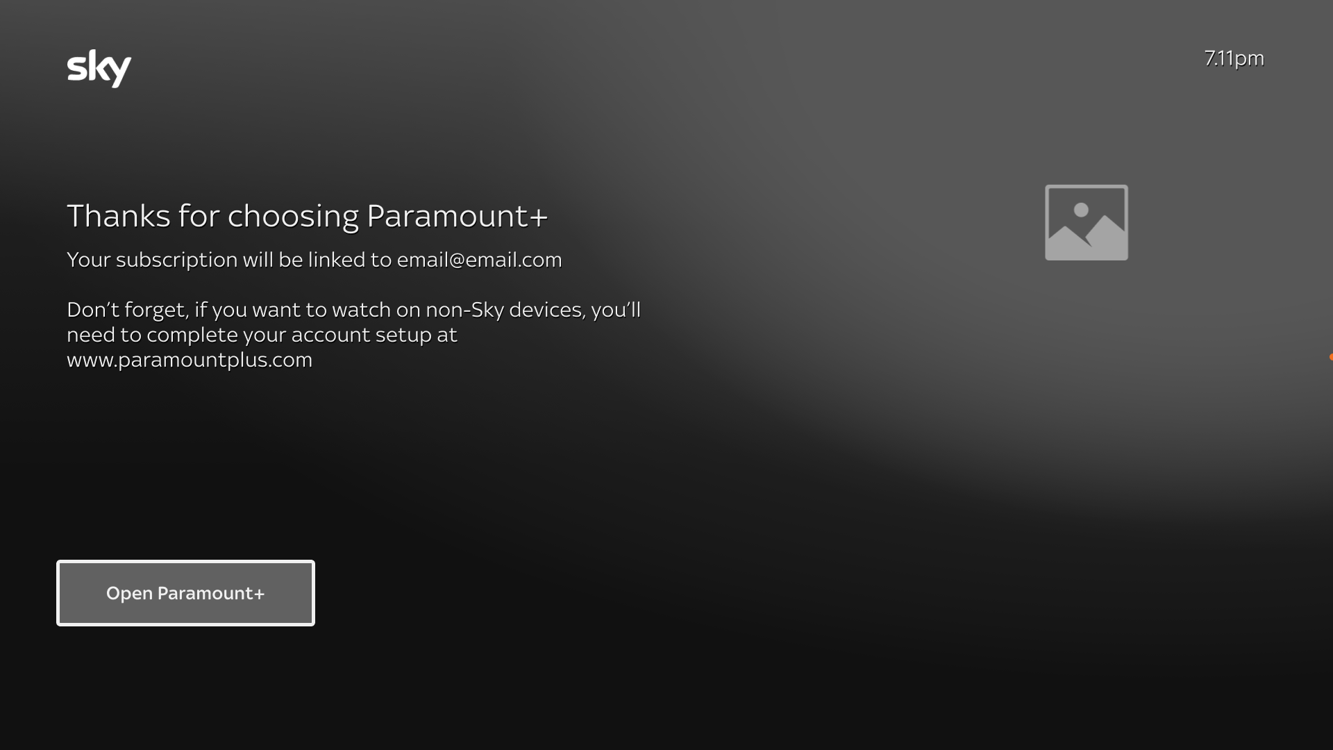
Paramount+ were legally obliged to include this screen after a customer has consented to sharing their email address.
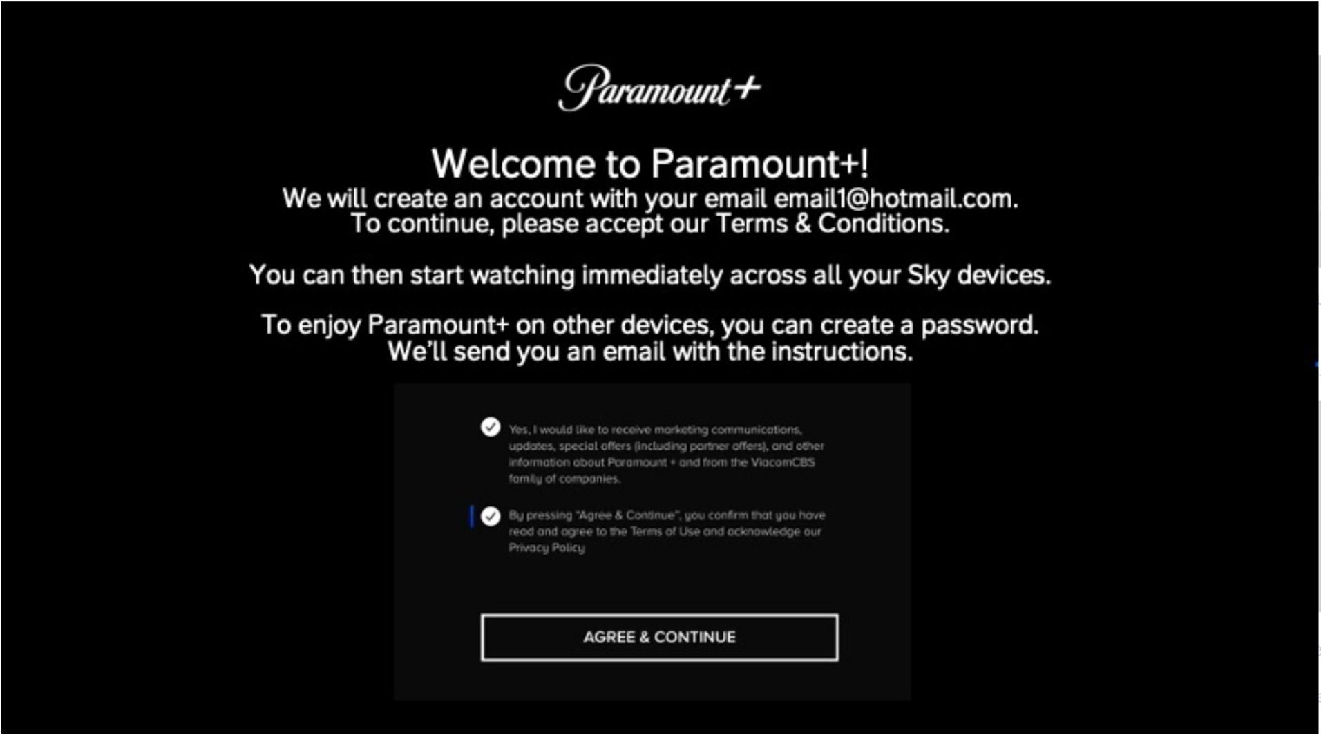
We had already managed this by presenting this success screen to the customer after they consent to sharing their email address.
There is a duplication of messaging across both screens.
The post-testing workshop brought together Product, Design, Research and Copy (Engineering were unavailable) for a cross-disciplinary review.
Together, we identified potential changes to incorporate both the research insights and the newly mandated Paramount+ screen.
Participants preferred sharing their email after reviewing plans but before payment, and wanted a clearer separation between purchase and account creation.
To balance this with Paramount’s new legal screen, we agreed to reposition the account creation prompt post-purchase, creating a more contextual flow aligned with user need for clarity.
For customers who preferred not to share their email, a fall back path would be the QR code screen which would give them the flexibility of inputting another email of their choice.

A demo of the full experience
Beyond Partial Account - Some Future thinking
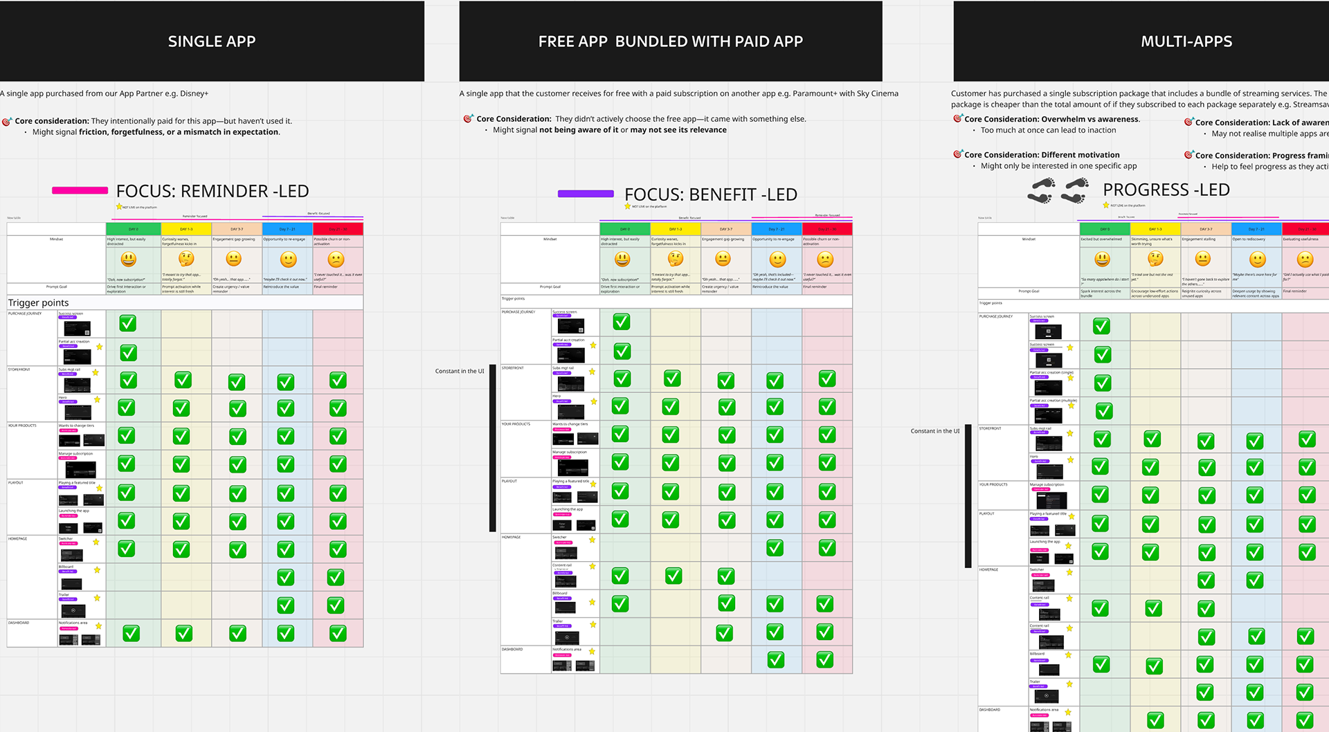
Activation Framework
While this project streamlined activation at purchase, the greater opportunity lies in sustaining engagement post-purchase.
Delayed activation erodes perceived value by the customer and also retention, so I created a framework defining when, where, and how Sky could deliver supportive, action-oriented nudges to activate.
Delayed activation erodes perceived value by the customer and also retention, so I created a framework defining when, where, and how Sky could deliver supportive, action-oriented nudges to activate.
Activation framework
Close up of Single Paid App Activation framework
Key Scenarios
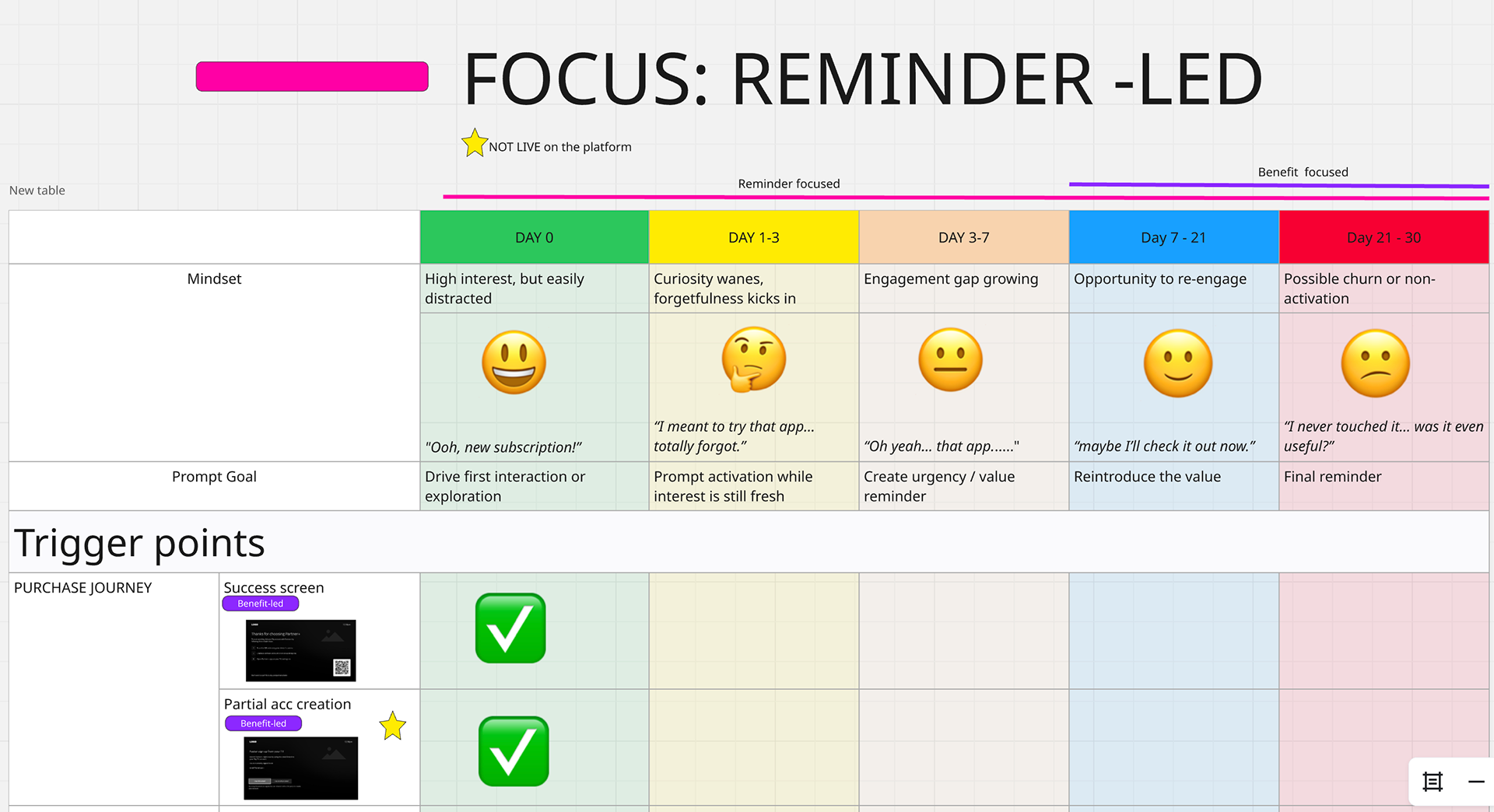
• Single Paid App Activation
Context: A customer pays for a standalone partner app such as Hayu but may not activate due to friction, forgetfulness or mismatched expectations.
Future opportunity: Use timely, value-led prompts to highlight the unused benefit e.g., “Your Hayu subscription is ready - start streaming now.”
Context: A customer pays for a standalone partner app such as Hayu but may not activate due to friction, forgetfulness or mismatched expectations.
Future opportunity: Use timely, value-led prompts to highlight the unused benefit e.g., “Your Hayu subscription is ready - start streaming now.”
• Free Bundled App Activation
Context: A customer receives a free partner app as part of a TV Pack (e.g., Sky Cinema/Paramount+). They may not be aware of the free app or find it relevant.
Future opportunity: Reinforce ownership and missed value e.g., “Paramount+ is included in your pack - activate today and explore your library.”
• Multi-App Activation
Context: A customer purchases a bundle including multiple apps (e.g., TV Pack + 2 partner apps). Activation can feel overwhelming.
Future opportunity: Reframe activation as progress driven and/or gamified e.g. "Activate your apps and level up your experience", reducing cognitive load and streamlining the process.
Design Considerations
Timing: Balance immediate prompts (right after purchase) with delayed reminders (when usage hasn’t occurred).
Framing: Use benefit-led language as well as reminder-led cues depending on context.
Channels: Explore in-TV intercepts, My Sky app notifications, and email reinforcement to ensure consistency without overloading customers.
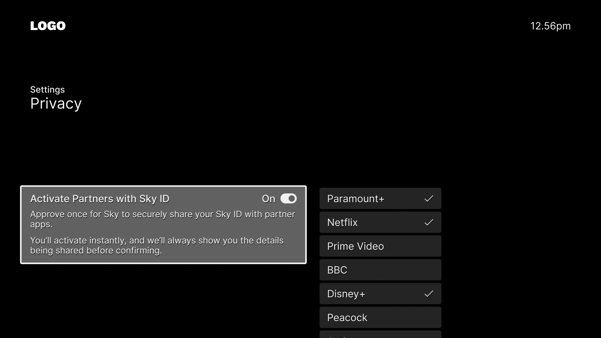
Blanket approval mechanism
I also saw an opportunity to let customers approve the use of their Sky ID details across multiple partner services so activation feels seamless.
REFLECTION
With limited Research capacity, I took a more active role in user research. This was a welcome opportunity that brought me closer to users and deepened my understanding of their needs. Tight timelines sharpened my stakeholder management, helping to maintain alignment and momentum throughout.
Key takeaway
Navigating the complex landscape of Commerce: This project required balancing priorities across internal teams and external partners like Paramount+, who came with their own proposed solutions. My open, transparent communication helped build trust, clarify constraints, and guide stakeholders towards a unified outcome.