Project Overview
Background
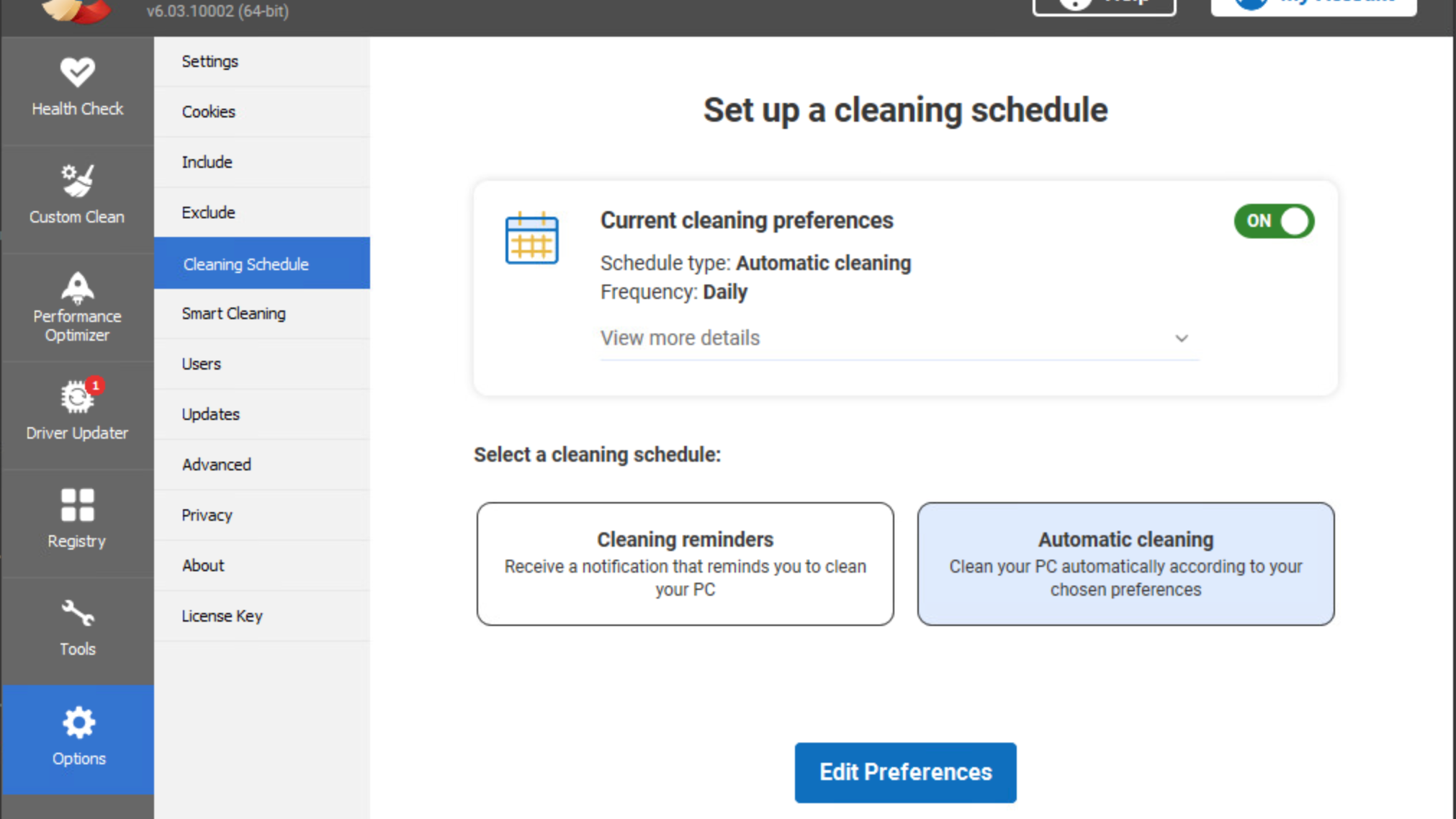
CCleaner is a desktop app that cleans and manages your PC. Customers receive regular In-app sales messages and can also manage their license within the app.
This was a 1 month project spanning from Oct 21 till Nov 21.
Customer Problems
• Irrelevant notifications: 10% of app uninstalls were due to reported complaints around the number of in-app messages and the lack of context around cross-sell promotions (Principle of relevance).
• License frustrations: painpoints around license management as it could only be done on the CCleaner website.
Business Goals
• Cross-sell promotions: a way to effectively execute this across the app.
• Contextual sales: Presenting in-app sales messages at the right time.
• Increase license activation rate: The number of users who activate their new product license was currently at 8%.
Scope and Constraints
• Scope included ALL CCleaner Customers (Free, Professional, Business and Technical)
• Constraints: narrow timelines for the project.
The Process
1. Discovery Phase
2. Wireframes
3. Usability testing & iteration
4. Accessibility Bluelines
Results
Within the first 2 months
• Post-update & post-install LTV (Life Time Value) of the user significantly increased to $5.77 (previously this was $0.25)
• 39% increase in the MAU (Monthly Active Users)
• License activation rate: This increased by 15%
The Process
Discovery Phase
Due to the short project timeline, I needed to compromise on the amount of research done in to the problem space.
Research scope was limited to Usability testing which helped answer some of the key questions we had around the Account menu solution.
"What features would be the most useful for users to access from the Account Menu?"
"What icon representation would resonate most with users?"
"What icon label would resonate most with users?"
I also conducted some desk research in to the different approaches other companies have taken towards the "cross-selling problem"
Wireframes & Feedback
The first iteration was a basic outline of the menu
Usability testing feedback
- Usability hub testing revealed that users would prefer to compare the different plans or at least view details of their current plan.
- "Upgrade to Pro" label felt too much like a 'commitment' for users.
Iteration 1
Iteration 2
I decided to provide a more obvious way for users to view their current plans and created a separate section for Upgrade options.
Usability testing feedback
- I felt the the cross-sell area was taking up a lot of screen real estate and the "Not Installed" looked clunky (this sentiment was confirmed by the wider UXD team when I sought feedback)
- Usability hub testing revealed confusion on whether the text "current plan" was clickable.
I tried to make it more obvious what plan users were currently on. I collaborated with the copywriter to clarify the cross-sell area. "Recommended for you" area contains products that haven't been installed.
Usability testing feedback
- There's still the problem of how to display products that have been installed by users.
- We agreed as a team that "Recommended for you" seemed too presumptuous as the user may question the basis on which it was made.
Iteration 3
User testing revealed that the most recent iteration made it easier for users to achieve their goals of viewing details of their plan, comparing and upgrading to different plans and seeing which CC products they hadn't yet installed ("You might like") and had installed ("My CCleaner apps")
Accessibility Bluelines
This was a new challenge for me as I had never done Bluelines annotation before on a design. I took it upon myself to learn how to annotate a design and research the rationale behind them. It was a very enjoyable task and piqued my interest in Accessibility.
Reflection & key takeaways
Looking back it felt that the Account menu was supposed to solve a lot of problems both for the user and the business; which is a high bar for one feature. The license management pain point turned out to be a much more complex problem than originally thought and I felt more time could have been allocated to fully understanding the problem.
Any research is better than none: The little research I pushed for at the start of the project really helped guide my design decisions.


