
Media
Driving Activation with a Simplified Account Creation Flow

Customer problems
Friction: Account creation spans multiple platforms (TV and Web) disrupting flow.
TV Input Pain: Existing research also revealed that entering details via the TV keyboard was often described as “painful and long.”
Business Goals
Increase activation rate: 39% of new Paramount+ customers activate on the day of purchase.
Scalable Solution: Design to onboard new partners through an agnostic approach.
Scope & Constraints
Prospect and resubscribing Paramount+ customers
Existing templates to support an agnostic solution
Impact & Success Metrics
8 weeks post-launch
• Lasting impact was a solution designed to scale seamlessly across our Commerce journeys for other App partners.
14%
65%
2
The Process
Understanding the EAA and what it means for the current experience
The EAA (European Accessibility Act) is a directive from the EU (European Union) aimed at improving accessibility for products and services across member states.
Purpose
• Reduce barriers for people with accessibility needs.
• Harmonise accessibility requirements across the EU.
• Create a single market for accessible products & services
The current experience was fragmented with voice guidance available in other parts of the platform but abruptly ceasing upon entering the Commerce app.


Voice guidance active up to this screen


Phased delivery
I phased delivery into 5 batches, prioritising high-traffic purchase flows such as Sky Sales and the App Marketplace (~40% of the user base enter these journeys)

Low fidelity to prioritise flow and clarity.
Agnostic journeys to enable scalable voice guidance across our Commerce scenarios.
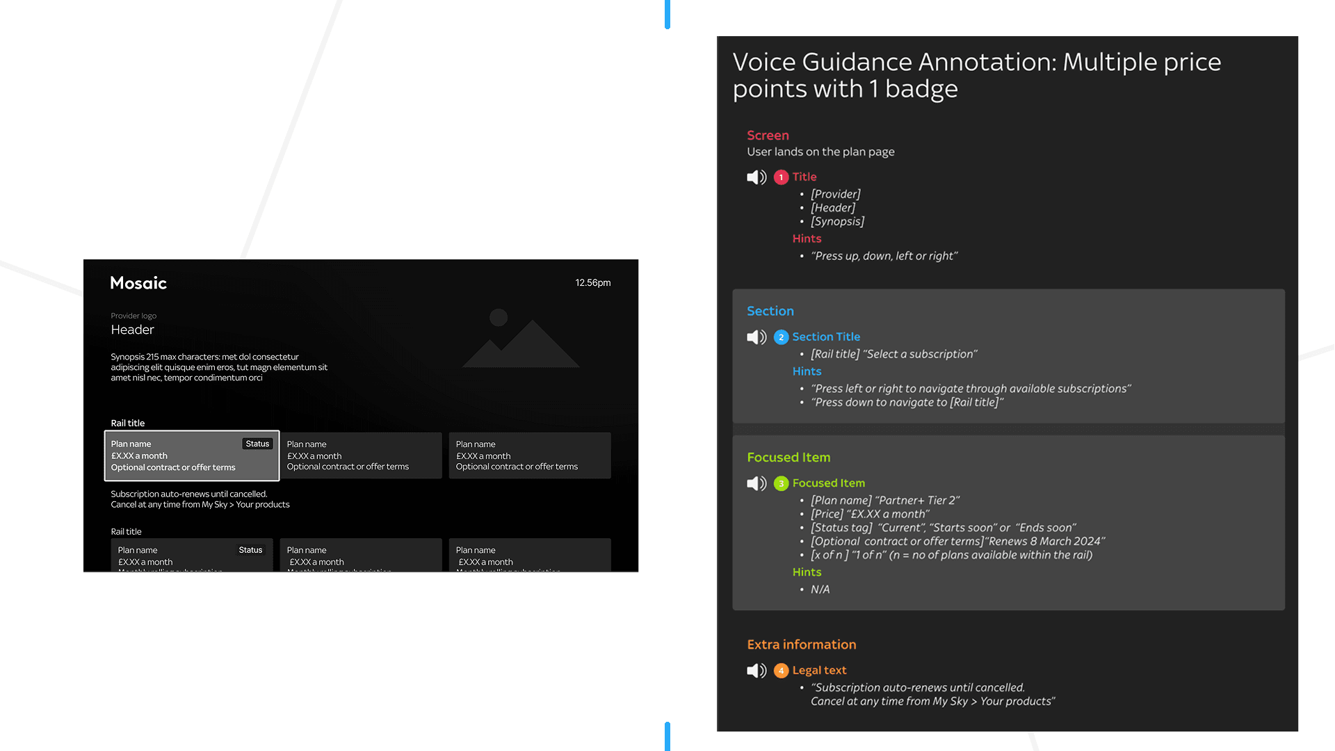
Voice guidance scripts are structured to provide auditory feedback, context-specific assistance and need to comply with accessibility standards.

This end-to-end process spans from voice guidance script creation through to development implementation and QA validation, ensuring quality and accessibility at each stage.

De-risking the payment experience
Users without a saved payment method were required to manually input their card details, creating a high-friction moment in the journey.
This impacts 28% of all our customers.

Manual card entry is already a high-friction interaction for sighted users and becomes significantly more challenging for blind and low-vision users.
Additional challenges with the current flow include
• Privacy: Voice guidance reads sensitive card details aloud, posing risks in shared environments.
• Cognitive overload: Users must juggle navigation and input, increasing effort and likelihood of drop-off.
• Error prone input: The current flow does not adequately support users with visual needs in identifying and correcting input errors.
While my remit focused on voice guidance, I identified this as an opportunity to improve a critical interaction and raised it with the project team.
Initial concerns centred on the impact to EAA timelines (Product & Legal) and the additional effort required (Engineering). To address this, I constrained my exploration to existing templates, ensuring any improvements remained feasible within platform constraints while minimising delivery risk.
Initial Design exploration
Proposal 1: Partial masked read back of card details
Rationale: Protects user privacy by confirming only the last four digits.

Proposal 2: If a customer has voice guidance switched on then redirect them to sky.com via QR code to take them to complete their purchase.
Rationale: Reduces input burden by enabling users to complete payment on web using familiar interactions and digital wallets.

Proposal 3: Privacy prompt intercept post-checkout
Rationale: This prompts users who have voice guidance switched on to confirm if they're in a private environment before entering sensitive details.

I presented these proposals to the Project team and we aligned on testing Proposal 3 to mitigate risk within the payment flow.
Testing Proposal 3 (Privacy Prompt)
I chose to run moderated user testing to better understand participants’ mental models and behavioural responses during the payment flow.
Due to recruitment costs and time constraints, I collaborated with our in-house accessibility tester to recruit 3 other participants from their network. This allowed us to balance speed and cost while still accessing users with relevant needs and lived experience.
Time constraints also meant that scope of testing would be the new journey being introduced since the manual card input is the current experience.

Using Replit, I created a prototype and layered voice guidance over the designs using a text-to-speech tool, resulting in a more realistic and testable experience (sample 27-second video below).
Testing Insights

Sky shop
🔍Insight
• Participants reported that it was a lot of audio information before selection options.
• Navigational hints on Screen and Section areas felt repetitive.
✅Action
• Reduced voice guidance copy to prioritise clarity and speed without losing meaning
• Removed redundant navigational hints (left/right) at the section level

Privacy Prompt screen
🔍Insight
• Participants responded positively to the privacy prompt.
• Its placement did not introduce friction or disrupt flow continuity

Web hand off to Sky.com ("Online instructions")
🔍Insight
• Participants easily located the QR code.
• Participants preferred the website URL to be read near the QR code
✅Action
I included the website URL in the hints section along with QR code position, to improve clarity and usability.
Despite being WCAG-compliant, Sky.com still presented opportunities to further optimise the user journey based on research insights.

Sky.com (Basket)
🔍Insight
• Key content sections were announced as ARIA regions rather than semantic headings, making the page structure harder for screen reader users to understand and navigate
✅Action
• Partnered with the Sky.com engineering team to address this, improving semantic structure and accessibility
Testing validated the Privacy Prompt and gave us the confidence to introduce it into the flow.
While initially launched as an MVP for voice guidance users, I advocated for it to be included in the Product roadmap to scale across all users, with adapted copy to ensure contextual relevance.
Full Prototype (2 min Video)
Design Principles for Voice Guidance
To ensure consistency and scalability, I translated research insights into a set of design principles for voice guidance.
🧭 Clarity and Conciseness
Prioritise brevity and clarity to support fast comprehension
• Balance information carefully to avoid cognitive overload or ambiguity
• Content must be adapted for audio. What works visually does not always translate aurally, requiring thoughtful adjustments

🧭 Avoiding Cognitive overload
Cognitive overload can also be experienced aurally which can be frustrating
• Prioritise essential information at each step to support clarity and ease of navigation.

Design Consideration
- Hierarchy of information within the tile.
🧭 Context awareness
Voice guidance should adapt to the user’s position in the journey and prior actions
• Once a plan is selected, guidance should clearly direct users to the next step.

Design Consideration
- Scripts should help the user build up a mental model of the screen they're on.
Reflection
What began as a regulatory requirement became an opportunity to reframe accessibility as a core experience principle.
By collaborating closely with engineering and testing with visually impaired users, I was able to define reusable interaction patterns that demonstrated both usability and long-term value. This helped shift the team’s mindset from delivering a minimal compliance solution to investing in a scalable, future-proof approach.
Key takeaway
🔑 Accessibility is continuous practice, not a one-off delivery. Sustaining it requires ongoing iteration informed by customer feedback, product evolution, and emerging accessibility standards.