
Media
Scalable Accessible Payments in Commerce

Customer problems
Barriers to entry: App-based Commerce journeys did not support users who rely on voice guidance.
Inconsistent experience: Voice guidance was available across the wider platform, but not within the Commerce journeys.
Business Goal
Regulatory requirement: EAA (European Accessibility Act) mandate.
Scope & Constraints
Blind and low-vision customers (existing and new)
Maintain consistency with the rest of the platform where voice guidance exists.
Impact & Success Metrics
Prior to launch, customers with visual impairments were 37% more likely to churn contributing to an estimated £82.5m churn value (per year).
By enabling voice-guided Commerce journeys, we reduced exclusion at a critical point in the funnel, helping protect revenue and align the platform with EAA requirements.
37%
39%
$5.77
The Process
Research under constraints
With limited time, I adopted a lean research approach, using usability testing to address critical questions and shape the Account Menu design direction
"What features would be the most useful for users to access from the Account Menu?"

Over 50% felt current plan info would be the most useful.
"What icon representation of Account Menu resonates most with users?"


"What icon label would resonate most with users?"

Wireframes & Validation
The first iteration was a basic outline of the menu.
🔍Insight
• Participants wanted to compare plans or at least see details of their current plans before making a choice
• The "Upgrade to Pro" label created friction by feeling too much like a commitment.
• Participants felt the cross-sell section dominated the screen space.


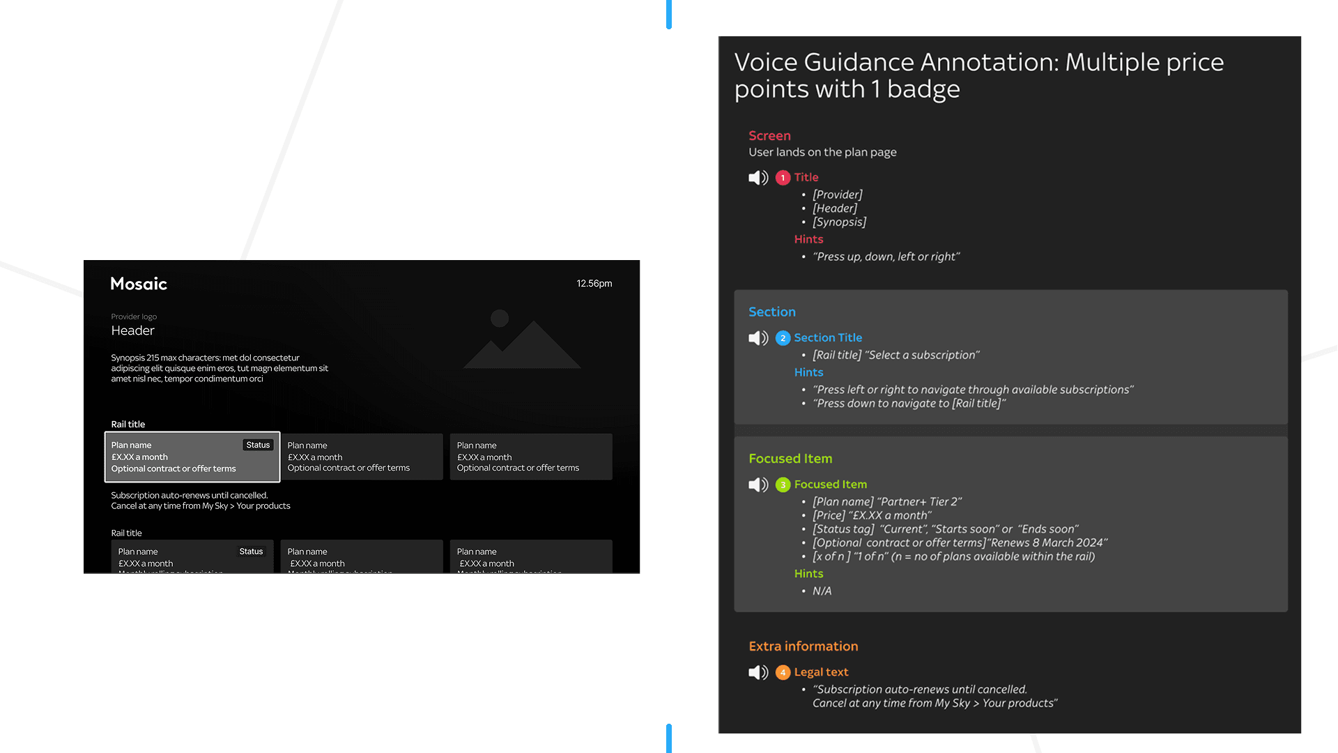
Accessibility
As I had never produced blueline annotations before, I took the initiative to upskill by researching best practices and applying them to my designs. The process not only ensured accessibility compliance but also sparked a deeper professional interest in inclusive design.

Reflection
The Account Menu carried the weight of solving both user and business challenges; an ambitious scope for one feature. License management proved far more complex than anticipated, warranting deeper exploration.
Key takeaways
🔑 Early research (no matter the scope) pays dividends in clarity and confidence